How Nullen Rebranded
Montessori Live
Created by Kyle Null
Published / 05.11.2018
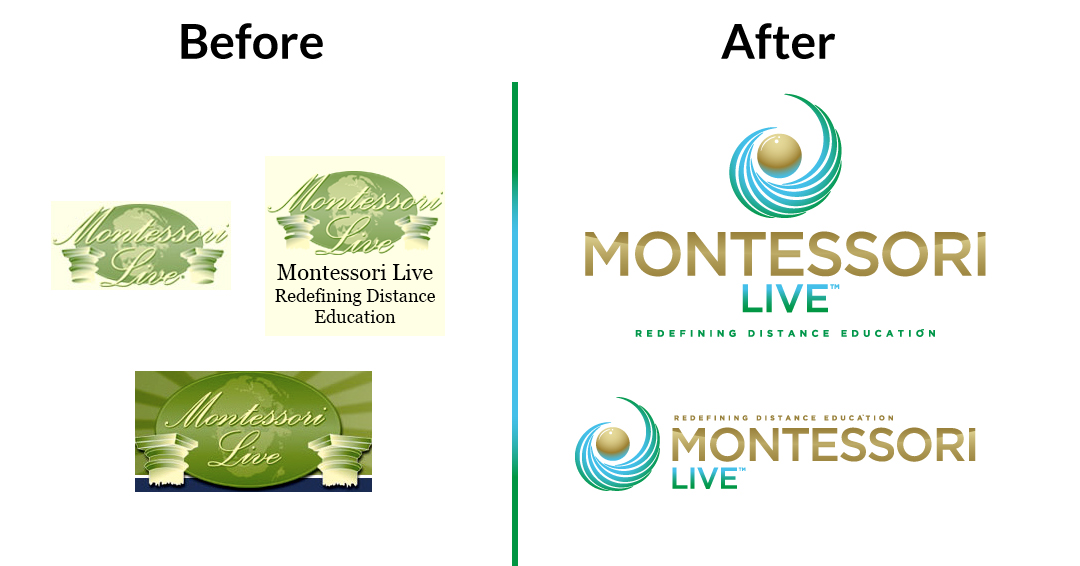
What we started with.
While getting to know Montessori Live, we quickly were able to determine the scope of challenges and updates they needed help with.Â
Two priority items stuck out like a sore thumb:
- Their brand needed a modernized design, look, and unified marketing narrative.Â
- Then their website needed completely redesigned to match these new standards.
We recommended that they have us lead a rebranding project for them, then afterword we’d work out the details to develop MLive’s Website 2.0.
Nullen’s go-to graphic designer is the incredibly talented and patient, Dan Meyer. We’ve been relying on his creativity and skills for the last 6 years — he even designed Nullen’s logo as well.Â
The process for creating a new company logo is iterative, but it’s extremely fun for those involved. We get a lot of joy leading passionate business owners and teams through the creative process, while simultaneously teaching them what good design is.
It all begins with many different concepts inspired by our initial discussions. The goal is to dwindle it down each time. For this project, we went one direction, but then our concepts and discussions that followed inspired new discoveries from Montessori Live’s team.
There is no settling when it comes to creating your company’s logo. Everyone needs to feel good about it, including us.
Round 1Â
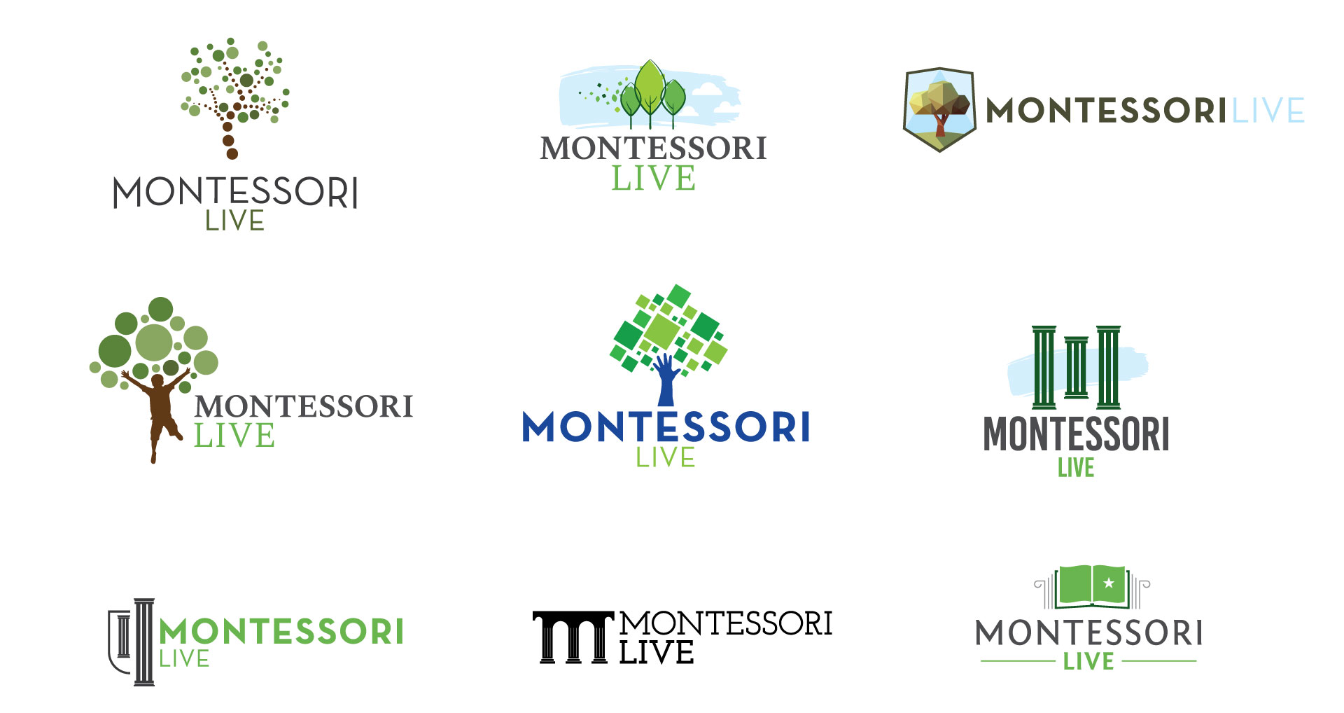
Montessori Live gave us a lot of creative freedom at the beginning. Dan and I worked together to pull inspiration from all the different Education organization types in the industry. We discovered the industry loves trees, hands, shadow children, books, and shields…why shields?
Montessori Live’s initial input was, “We’d like to see the pillars from our original logo incorporated somehow.” So we added the pillars in a few of the concepts, even though we thought it’d be challenging to make them fit within the modern design themes we were trying to encourage.
Round 2Â
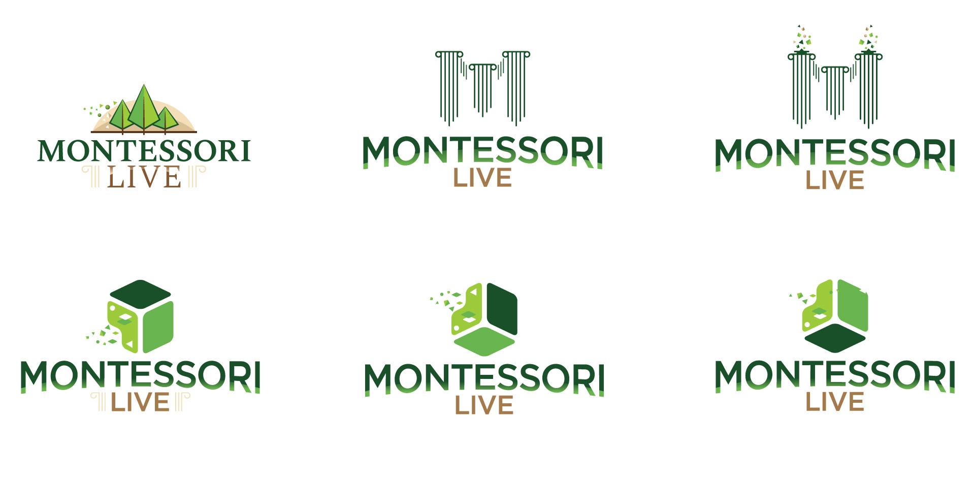
The first set of concepts gave the Montessori Live team a lot to think about. They still wanted to see an evolution of the pillar concept, but we also asked them to branch out, which led to them requesting some of the concepts to be based on well known Montessori materials.
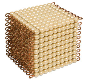
The cube is an incredibly versatile Montessori material, used in many lessons that the children encounter year after year. We thought taking one of these cubes and showing the grammar shapes combining digitally into it would be a fun visual. We also assumed this would be the direction they’d lean towards.
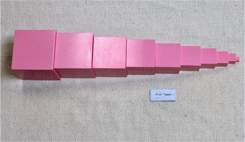
FYI: The most well known Montessori material made from individual cubes is the Pink Tower.
Round 3
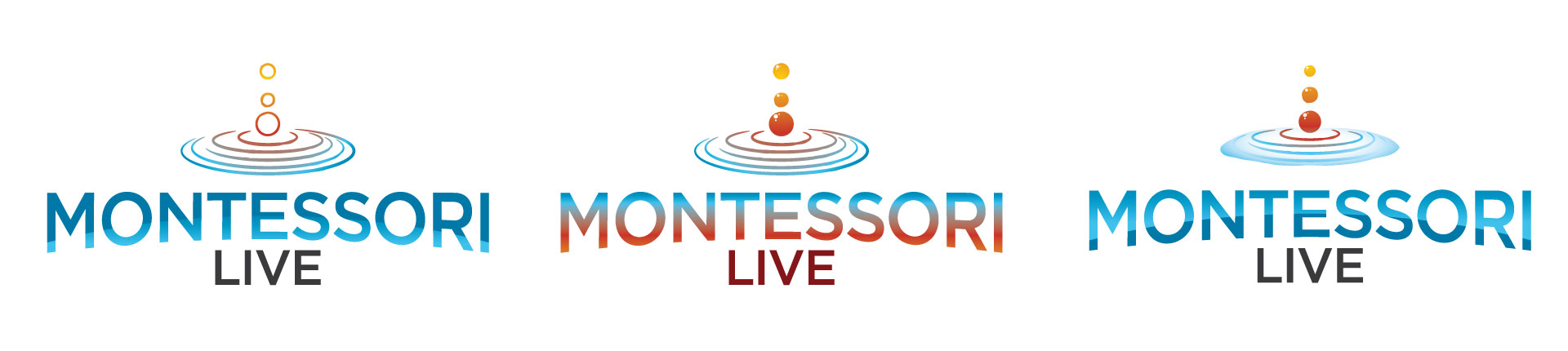
All of a sudden we’re looking at something completely different from the previous round. It isn’t necessarily normal for this to happen. The rules of the “Design a Logo Game” are to eliminate concepts until you get down to one. However, this was a special case, because the Montessori Live team had a revelation during the discussions with us from the Round 2 concepts.
The discussions that arose led to two clear ideas:Â
- Montessori is all about finding harmony within the analog world: nature.
- Montessori glass beads, that the cubes are also made out of, are beautiful.Â
We thought it’d be a powerful visual to take an individual strip of the beads and drop them into water, thus creating a ripple. Metaphorically, this represented Montessori Live maintaining the traditional core values of Maria Montessori (the bead), while they try to disrupt the status quo of the industry by offering an online certification option (the ripple).
Round 4
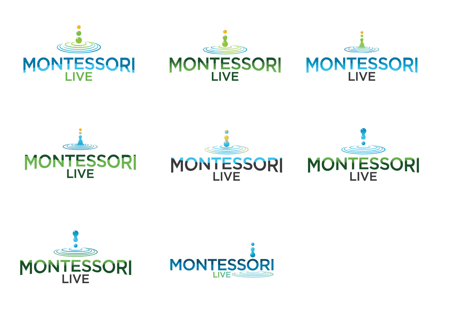
So now we’ve got a lot of new variations. The beads have evolved to looking like water droplets, but we agreed it made sense to turn the dinky ripple into a powerful wave. Also, water rippling out from a droplet of water is extremely common.
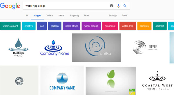
A quick Google search turns up:
Round 5
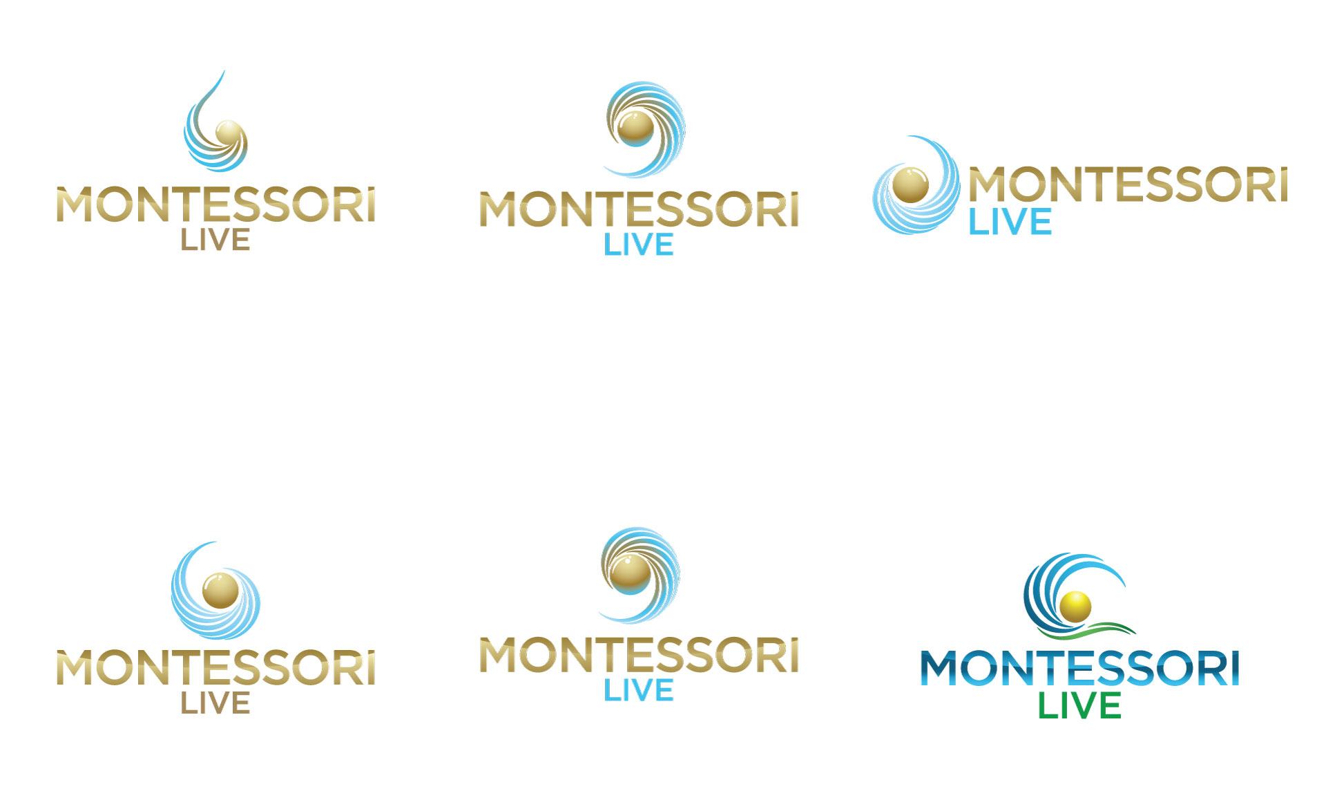
I led the discussions going into the 5th round expressing how important it is to take the bead + wave concept and mold it into one icon. I wanted the bead and the wave to appear as if they exist in the same universe. This would represent the perfect harmony Montessori Live expressed being at the core of the philosophy, while achieving all the other cool metaphors we were going for.
Round 6Â
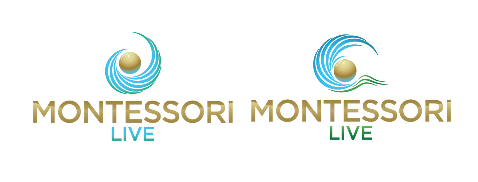
And then there were two.
When looking at this it becomes obvious who the clear winner was. The one on the right is just a, “bit too much.”Â
Now all we have left to do is polish the winner and make all of Montessori Live’s digital assets out of it.
Final Digital Assets
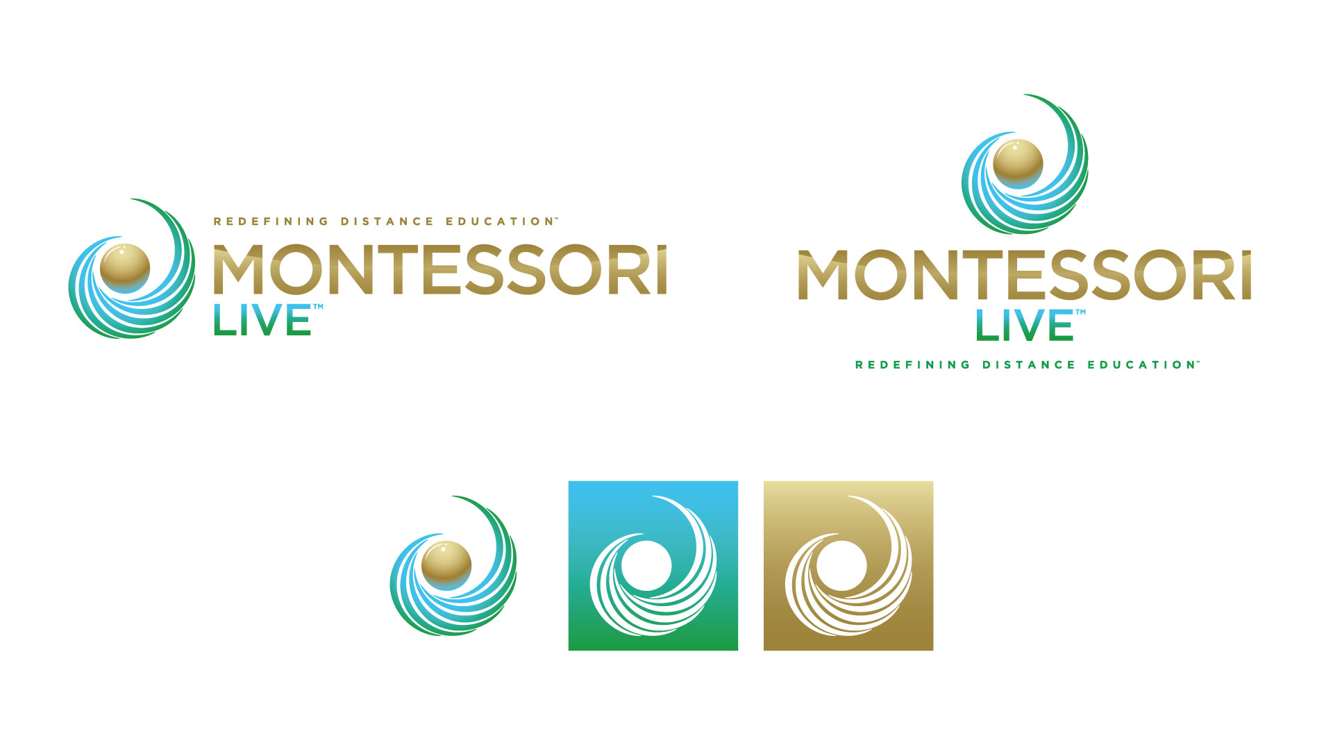
One of the biggest selling points of investing in a rebranding project, is that many organizations have used the same logo for many years. What they’re missing out on is that they can own updated digital assets that offer flexibility for branding: documents, ads, PowerPoint templates, contracts, business cards, merchandise, their website, and social media properties.Â
Having control and ownership over your digital branding assets becomes critical for any marketing efforts that you do both on & offline.
Above, you’ll see a horizontal banner logo, a vertical logo, and then 3 social media icon variations.  We also provided them with a large package of document templates, newly designed student handbook, 3 different types of business cards, newly designed certifications and diplomas, a brochure, a one page handout, and even e-mail signatures for staff members.
All of which can be resized, used on any background, and adapted easily into anything they want to put their branding on.Â
If you’re interested in having us collaborate with you on a similar project, feel free to get in touch.