Nullen’s History Working with Nonprofits.
Written by Kyle Null
Last Updated: 3/2/2022
I’ve been working with nonprofit organizations since I was 13 years old. As I write this, I’m now 36 and still have multiple nonprofits as clients. My father worked in the nonprofit healthcare industry for 38 years. After being VP of Finance at Holy Cross he pivoted to starting his own consulting firm and took on multiple nonprofit healthcare facilities. When I was 13 years old, my older brother and I became his IT guys. We fixed computers, trained employees, taught residents, built websites, and setup AOL for a whole lot of people (keep in mind this was 1999 – 2003).
I continued working as a consultant for my Dad throughout High School. After I graduated from IU Bloomington with a degree in Informatics I decided to go work for a nonprofit Montessori school in Mishawaka, Indiana called Montessori Academy at Edison Lakes (MAEL).
From that point, I truly dug into my passion for both the nonprofit and education worlds. I became the IT Director and Informatics teacher. I also volunteered all 4 years at the South Bend Boys & Girls Club where I founded technology & music production programs and helped build their computer lab. As the IT Director of MAEL part of my responsibilities became raising money for my tiny department. Over the course of my 4 year tenure there I brought in over $250k in value of technology donations through creative events, contacts I developed, grants, and nonprofit programs.
After founding Nullen I began supporting MAEL, Montessori Live, the Giving Voice Foundation and Holy Cross Village at Notre Dame as clients.
Some notable achievements in the nonprofit world:
- Helped HCV break over $1million in donations a 334% increase for 3 years straight.
- 6,000+ subscribers on MLive’s YouTube channel and getting them a nonprofit partnership with Youtube.
- Saving MLive from bankruptcy via new marketing and IT strategies.
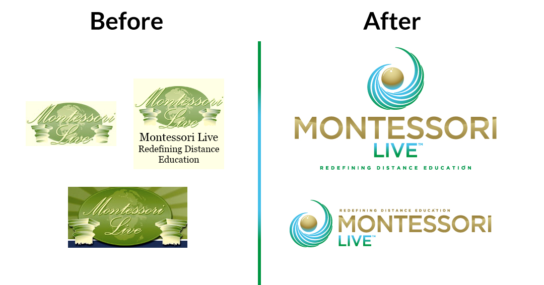
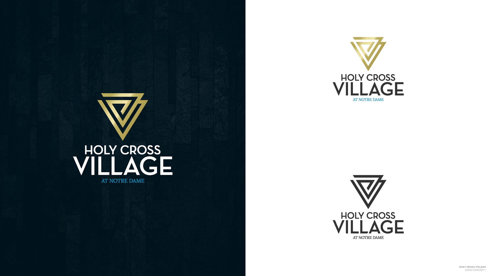
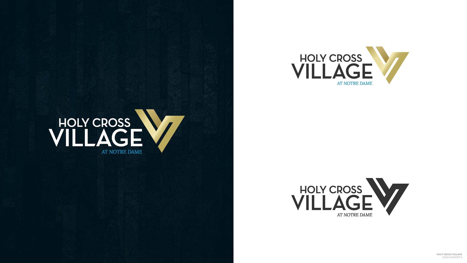
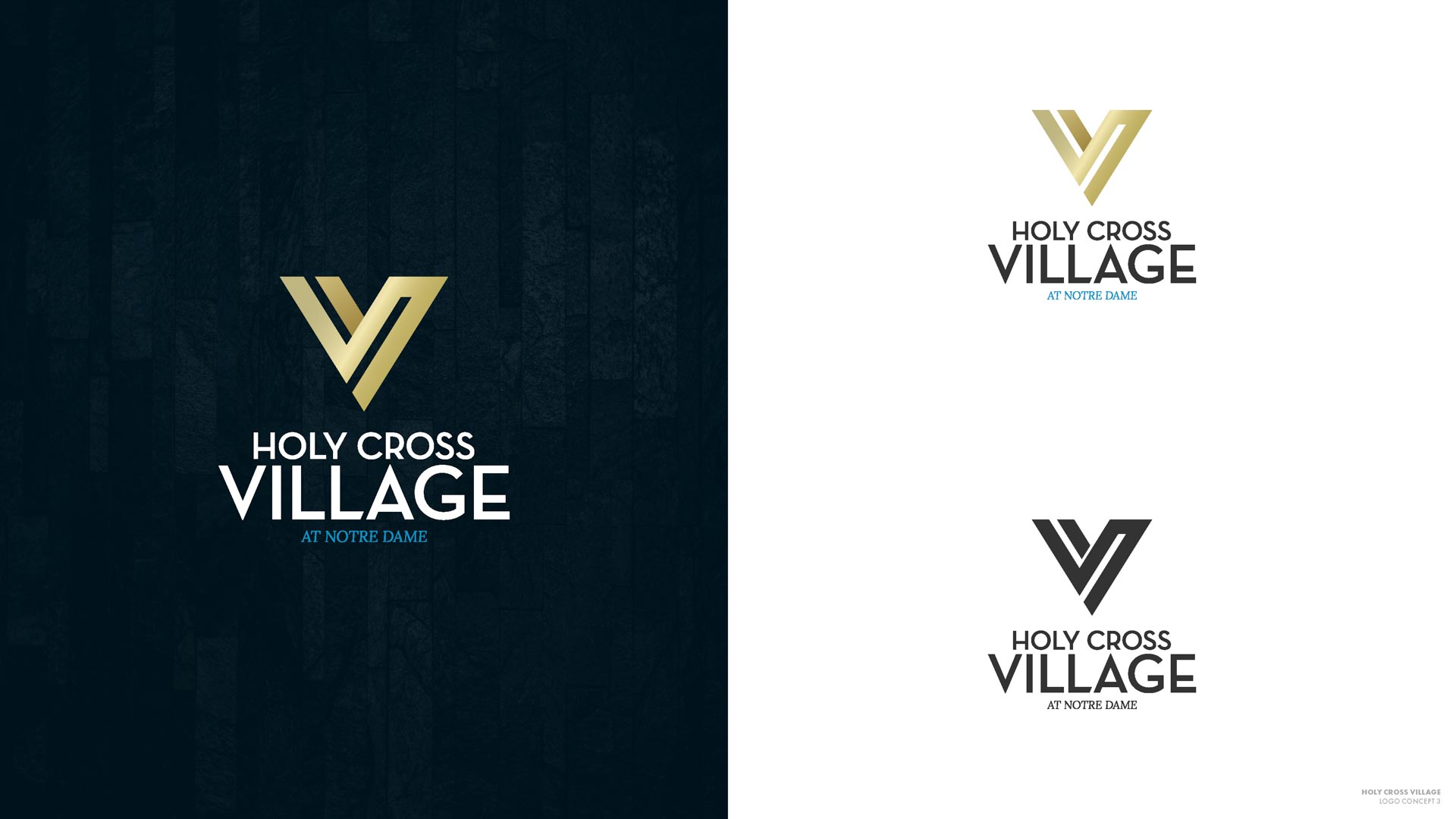
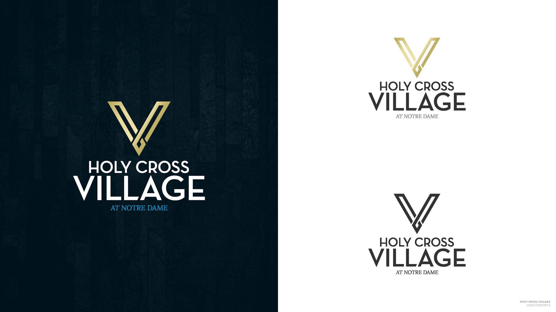
- Rebranded both HCV & Montessori Live.
- Created the name & brand identity of the Giving Voice Foundation.
- Overall, have helped clients bring in over $5 million in donations.
Rebranding Holy Cross Village at Notre Dame
Project Overview
When we first discussed a rebrand with Holy Cross Village at Notre Dame (HCV) in January 2019, they had been using the same logo for many years. No one knew where it came from, how long they’d been using it, who made it in the first place, or why there was a tree inside a cursive V. They only had one low-resolution image file of their logo (below), shared ad hoc throughout the organization. The aged file couldn’t be enlarged to be print much beyond the size of a postage stamp, and didn’t support transparency, so it could only ever appear on a white background. This is a familiar situation for us, and HCV is precisely the kind of client we love to help: one where we can have a big impact.

The first step in starting a complex rebranding effort was to get everyone on the same page. We formed a Digital Integration Team (DIT) with key decision makers from HCV’s leadership staff (CEO, COO, and directors from each department) and met bi-weekly for strategy meetings. The projects we launched ultimately helped HCV reach their full potential, especially with respect to their goal of encouraging greater advocacy throughout their community and organization.
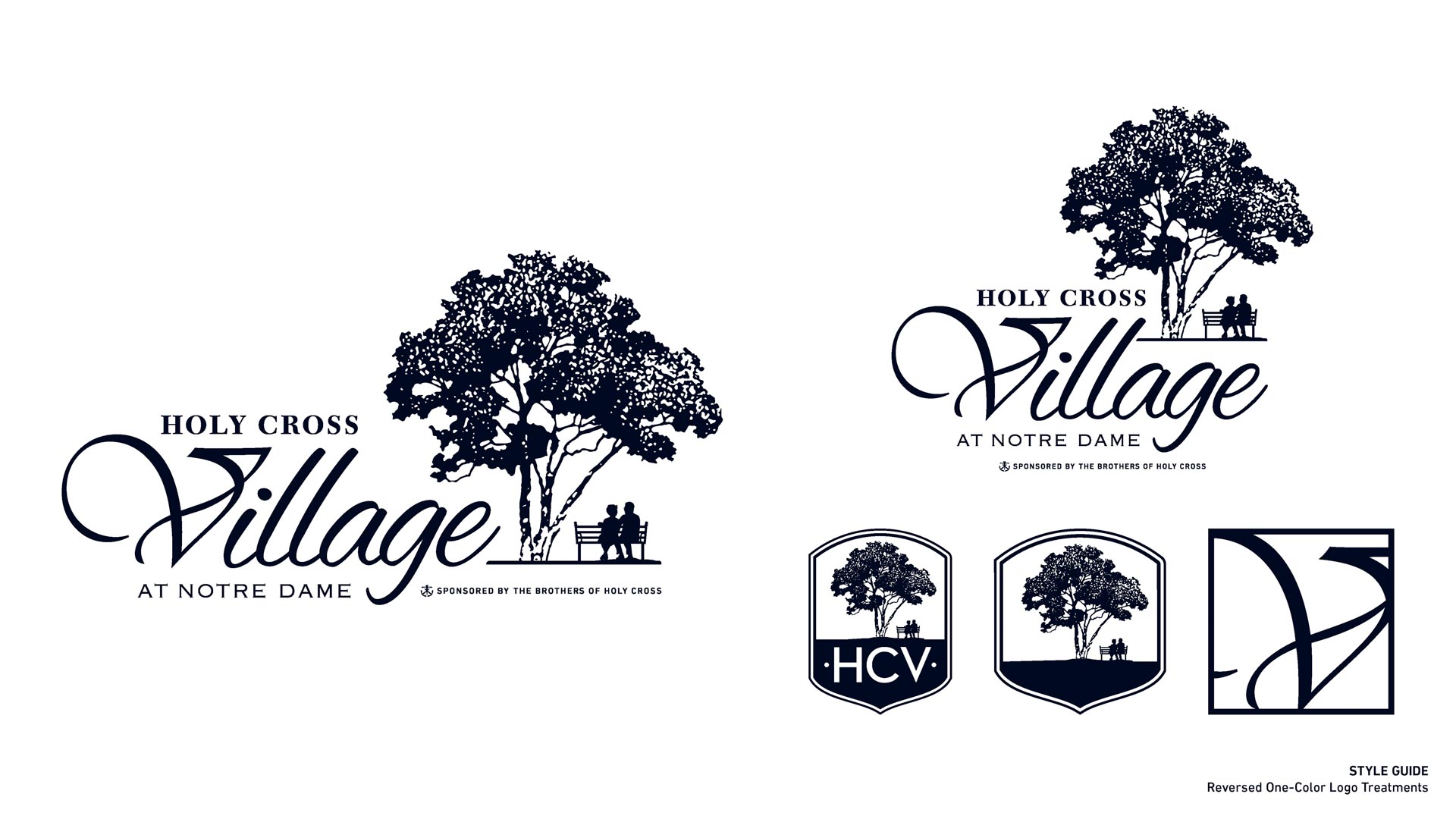
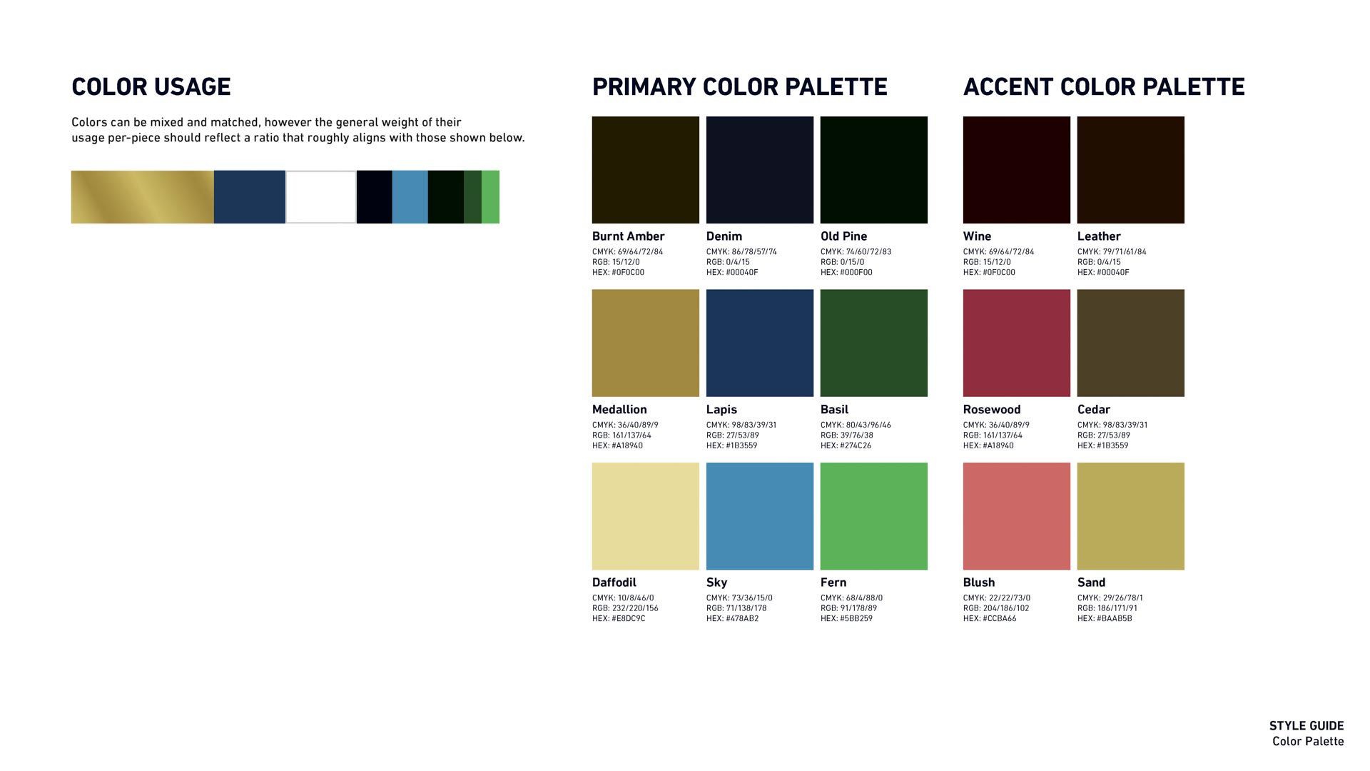
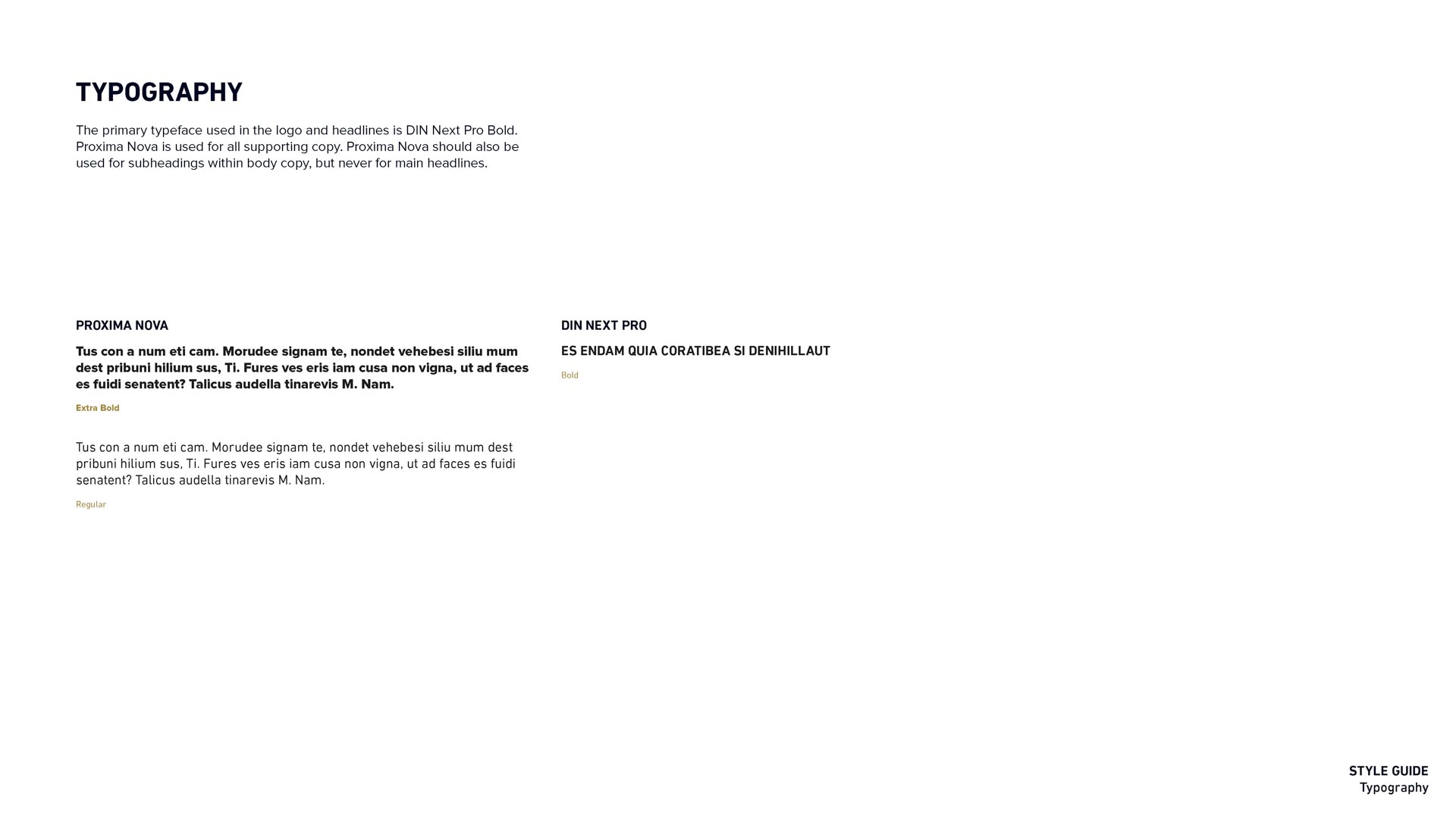
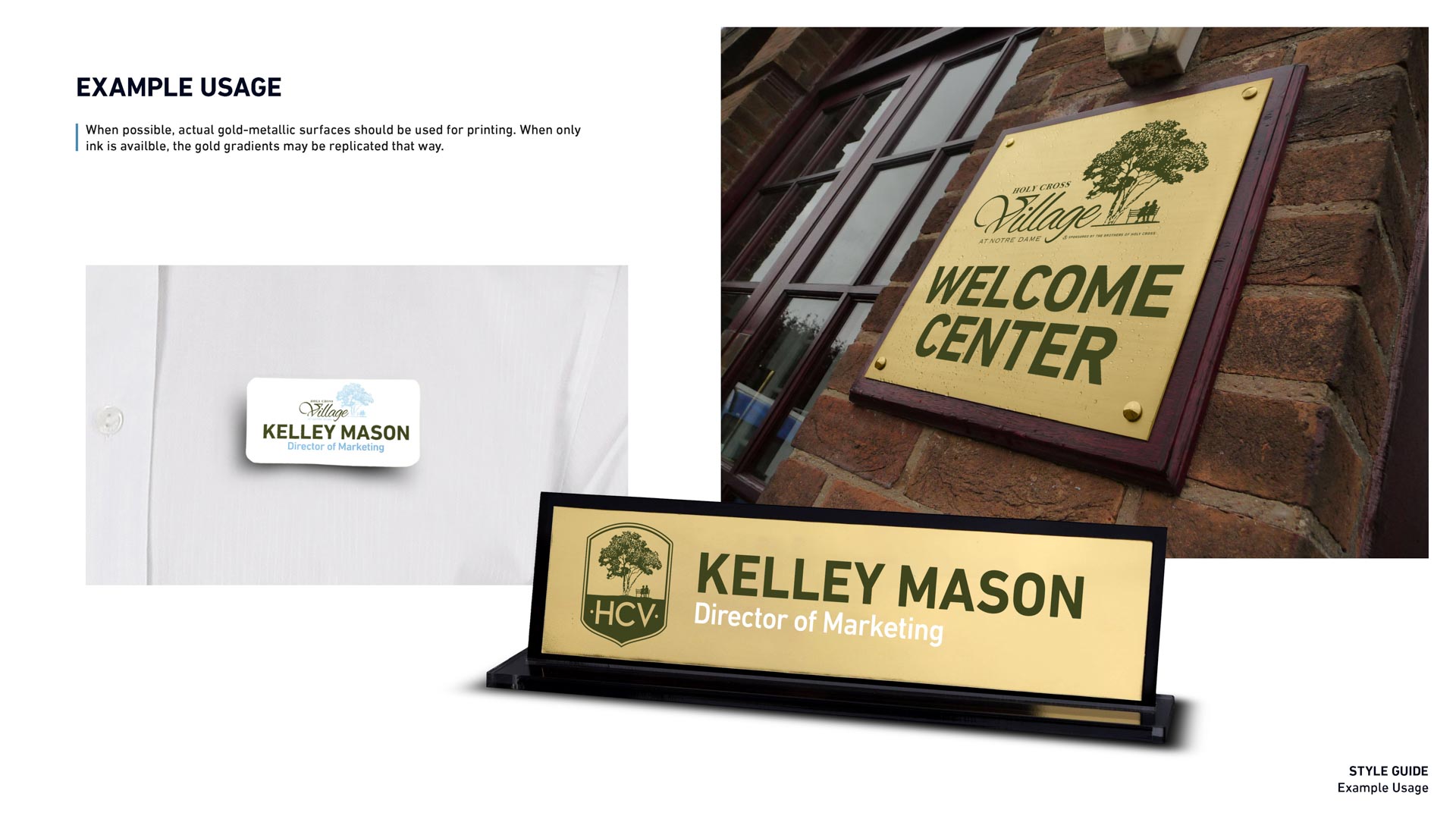
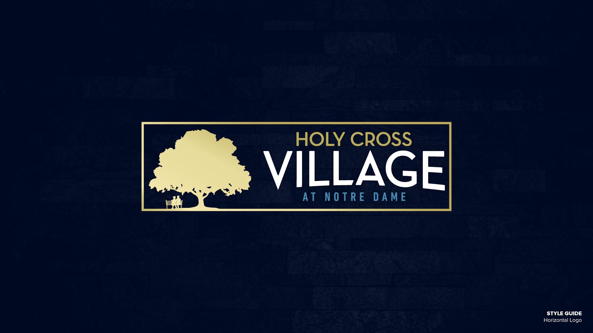
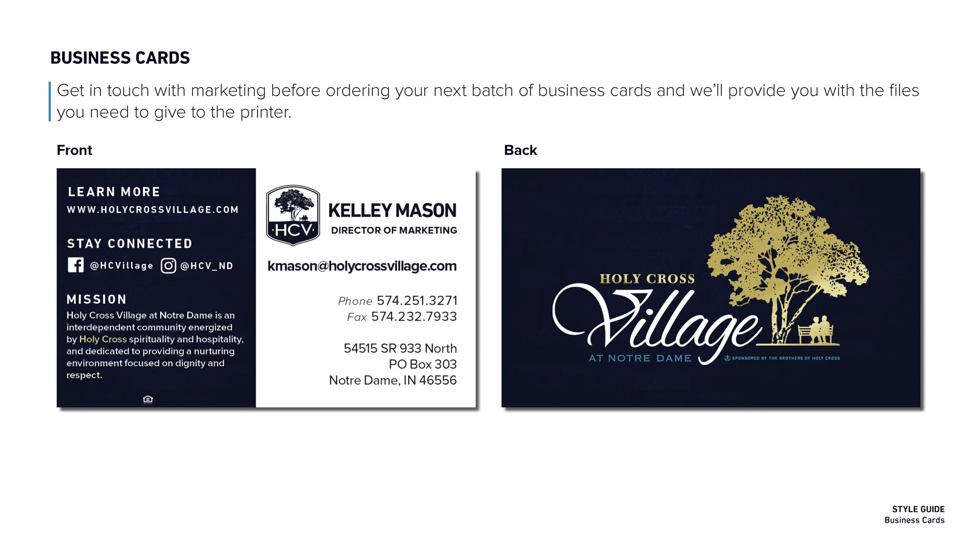
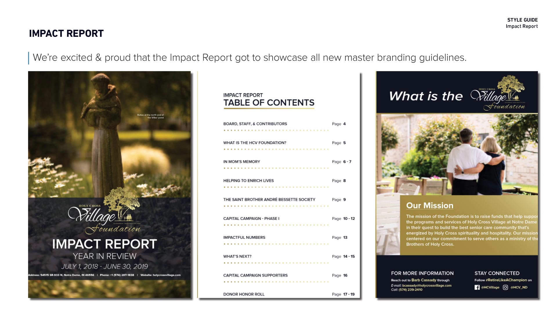
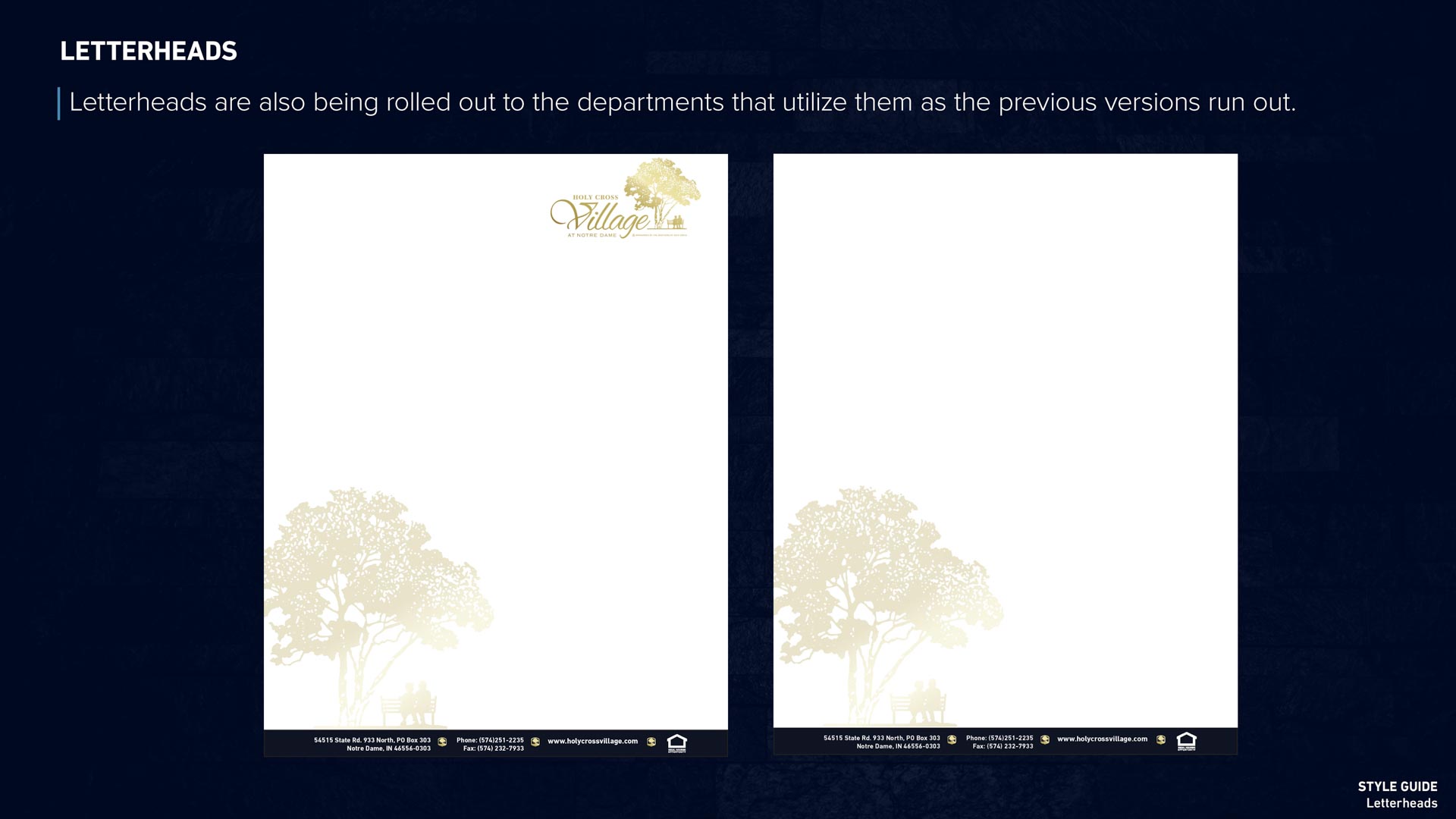
By November 2019 we were ready to roll out fresh new brand and assets: business cards, email signatures, and new, multi-use variations of the logo. Everything lives in a public shared drive that staff can now access and use independently into their own projects. We outlined master branding guidelines in a PDF with situational logo usage, color codes, and typography, implemented policy changes, and trained HCV’s internal marketing team to keep the brand consistent and professional throughout the organization.
Round 1
We started with short, rough list of initial themes:
- Luxury feel.
- The letter V as the primary graphic.
- A tree as the primary graphic.
- A cross incorporated into or as the primary graphic.
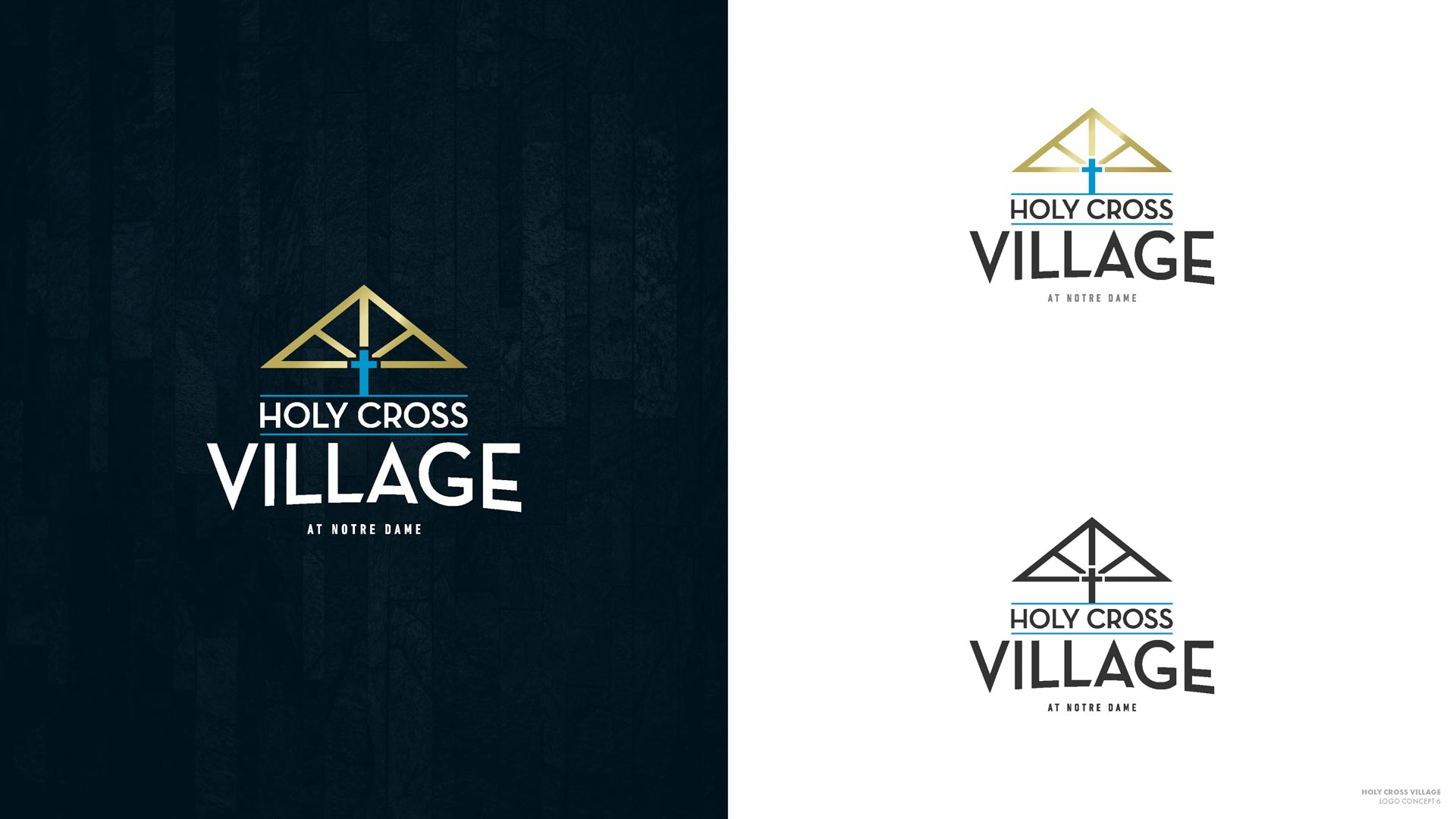
The cruciform imagery was ruled out quickly: it’s too intimately associated with (Christian) church. Though the Brothers of the Holy Cross are a Catholic organization, it was imperative not to exclude other faiths in their branding.
Rounds 2 & 3
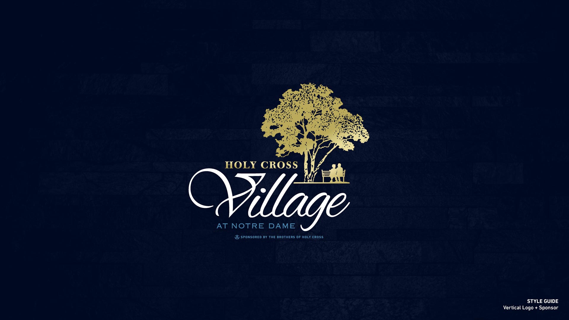
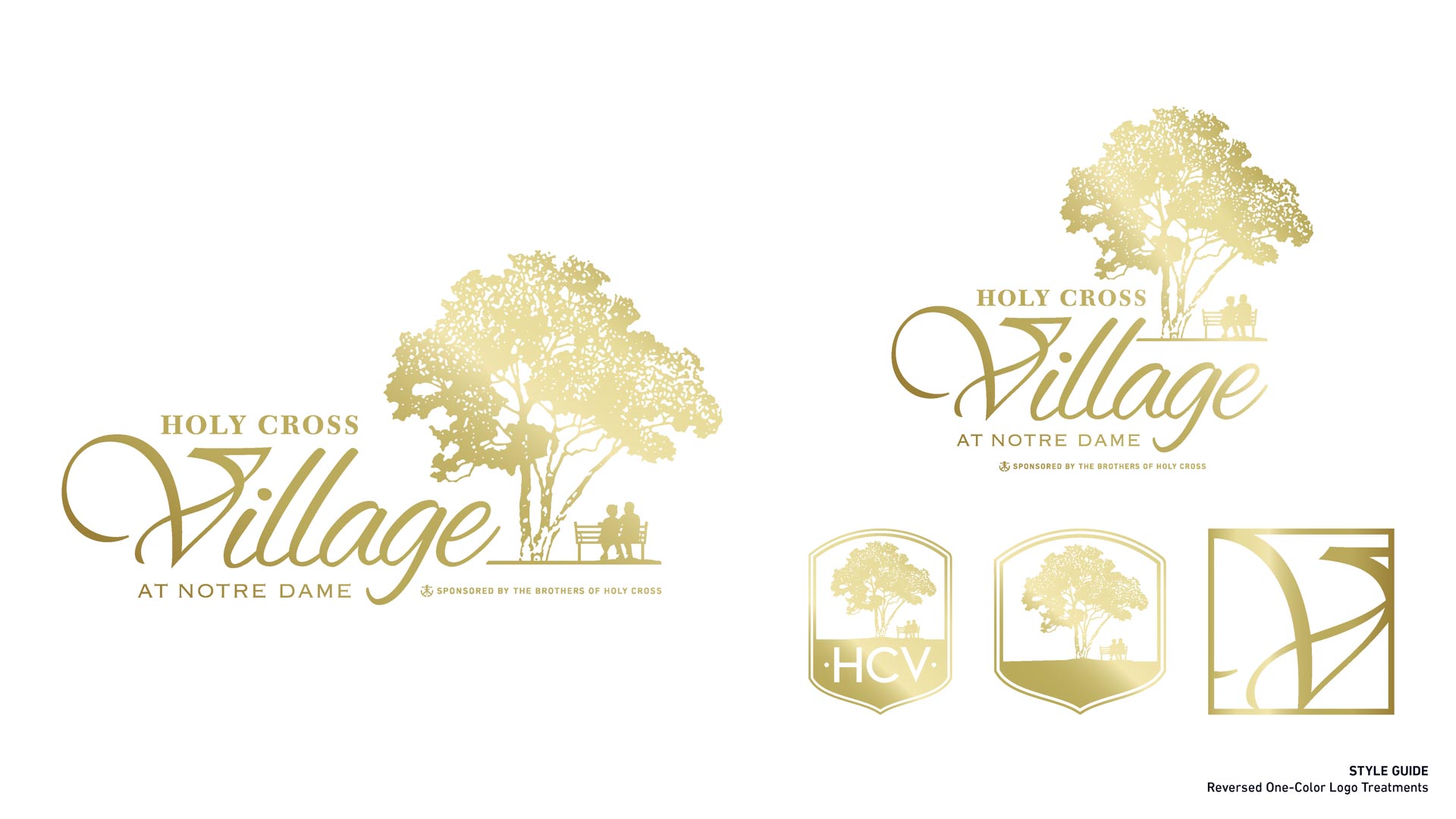
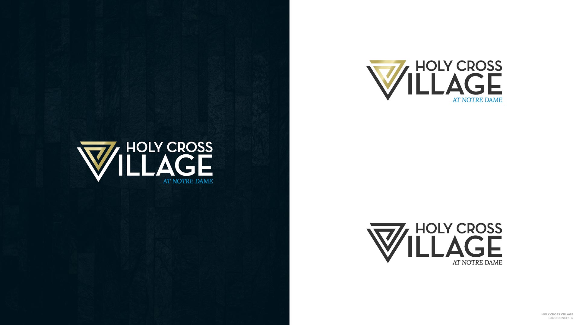
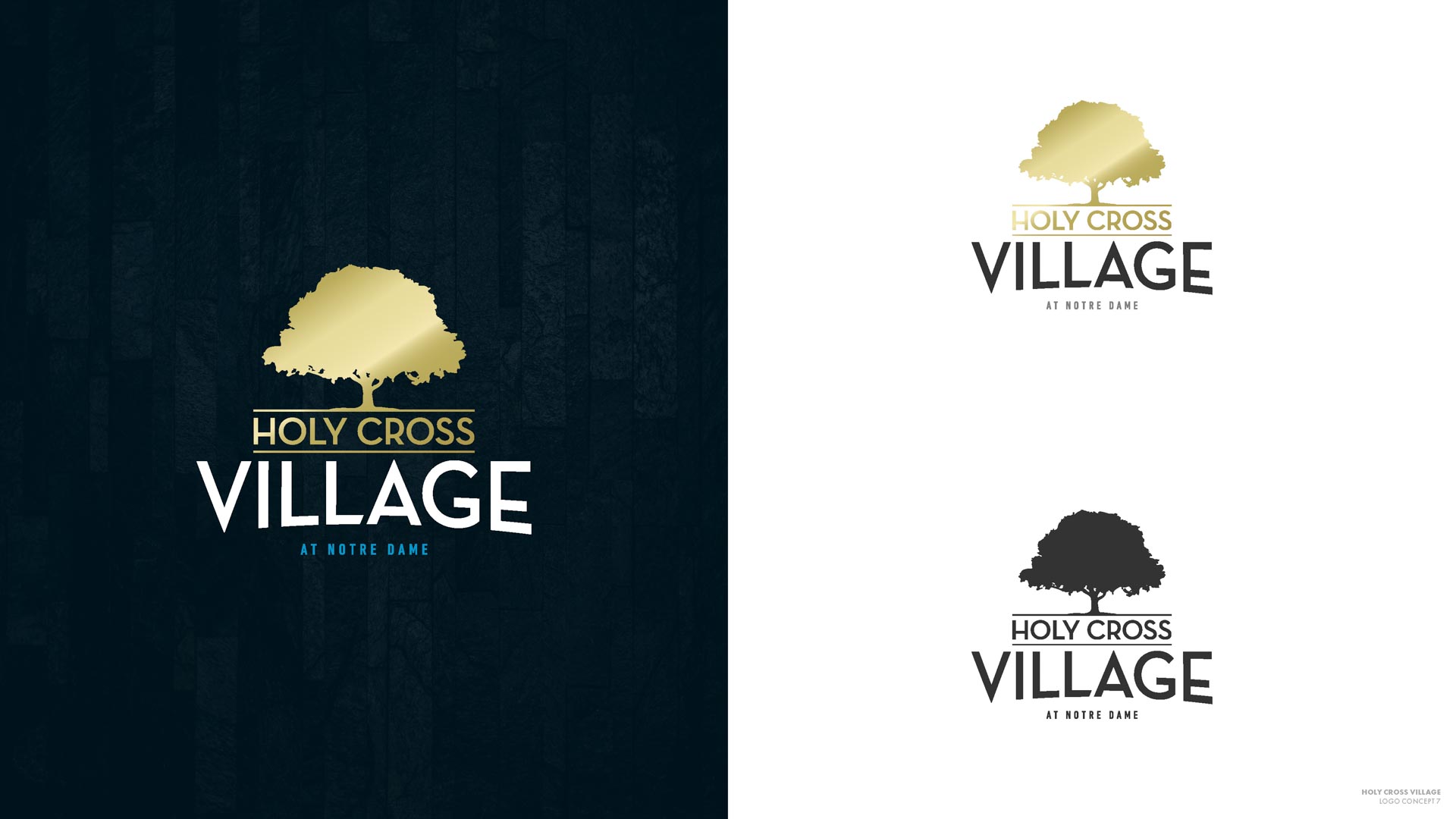
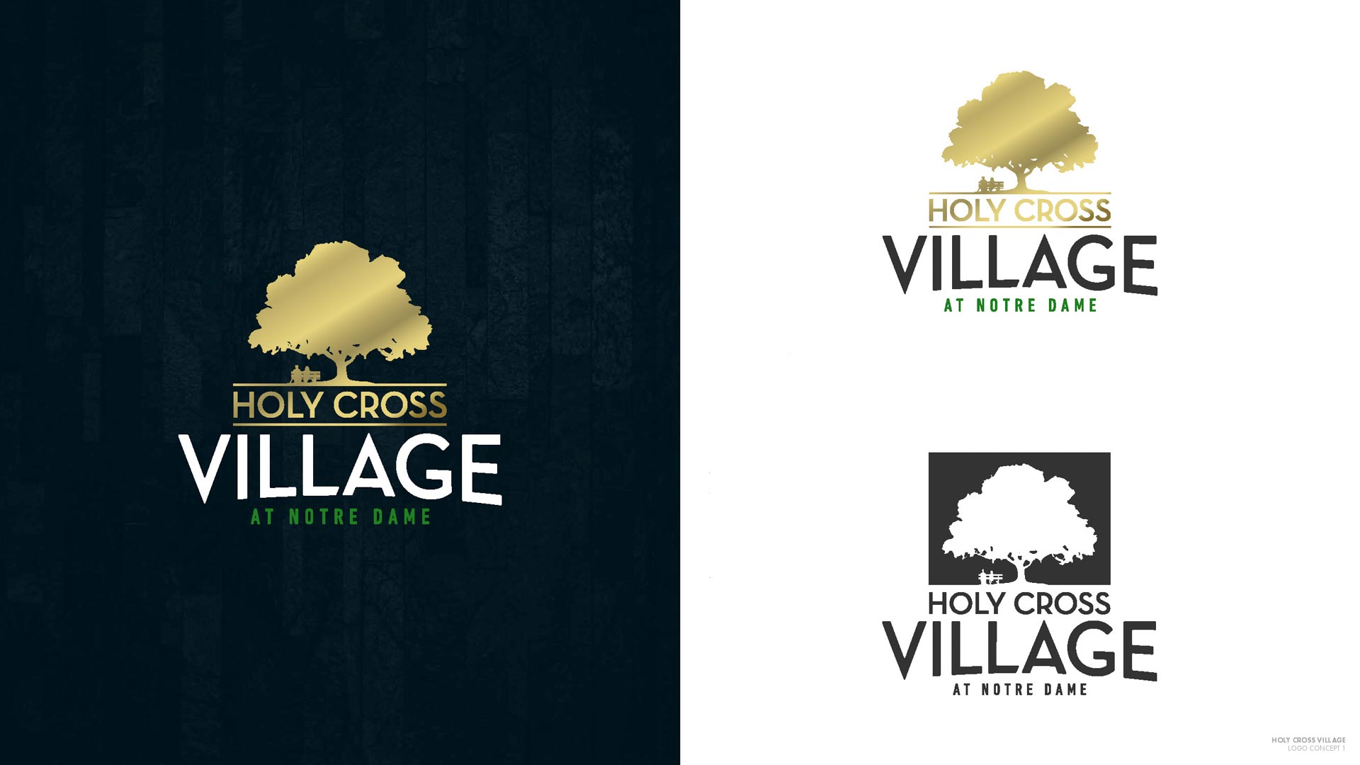
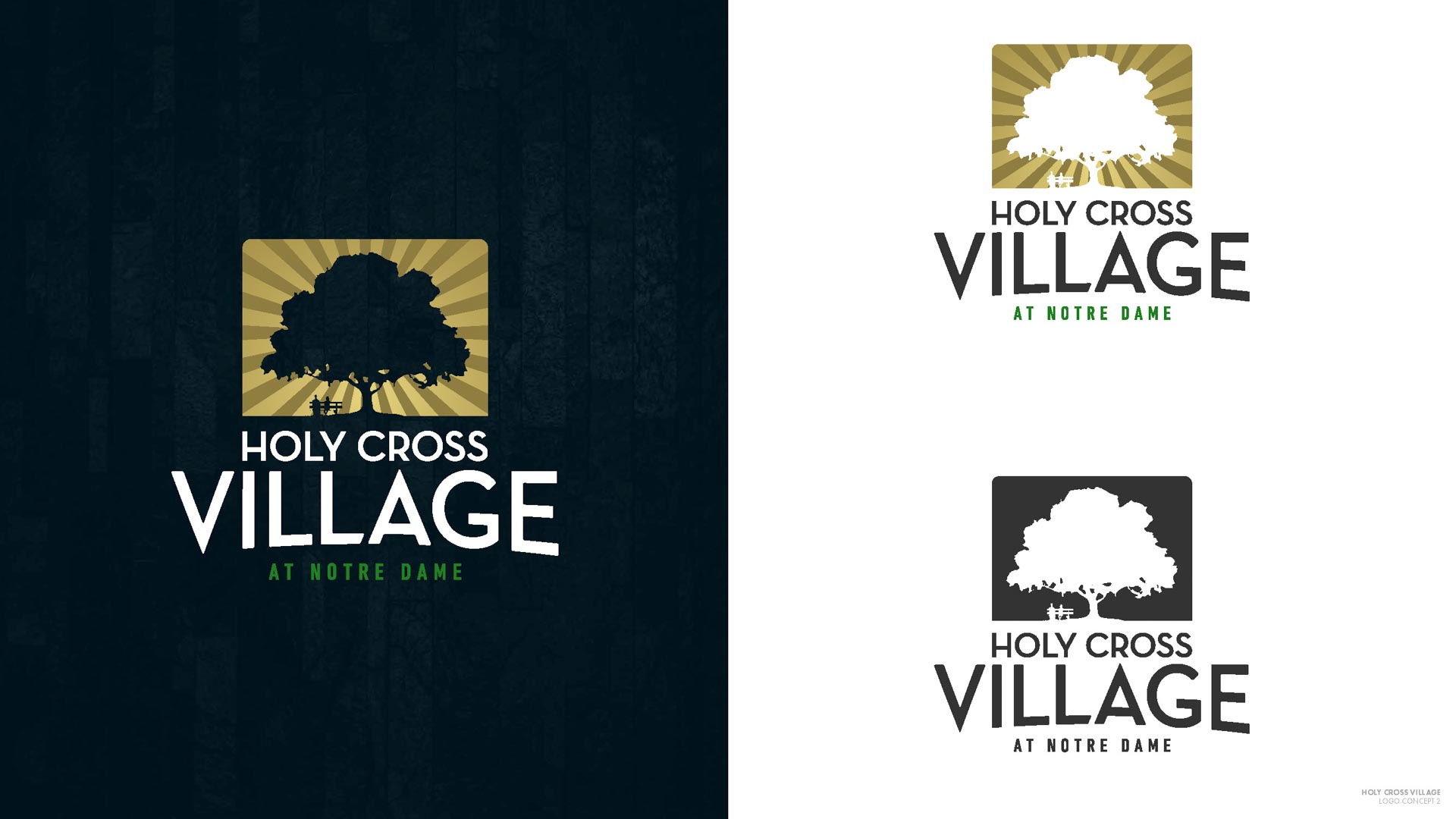
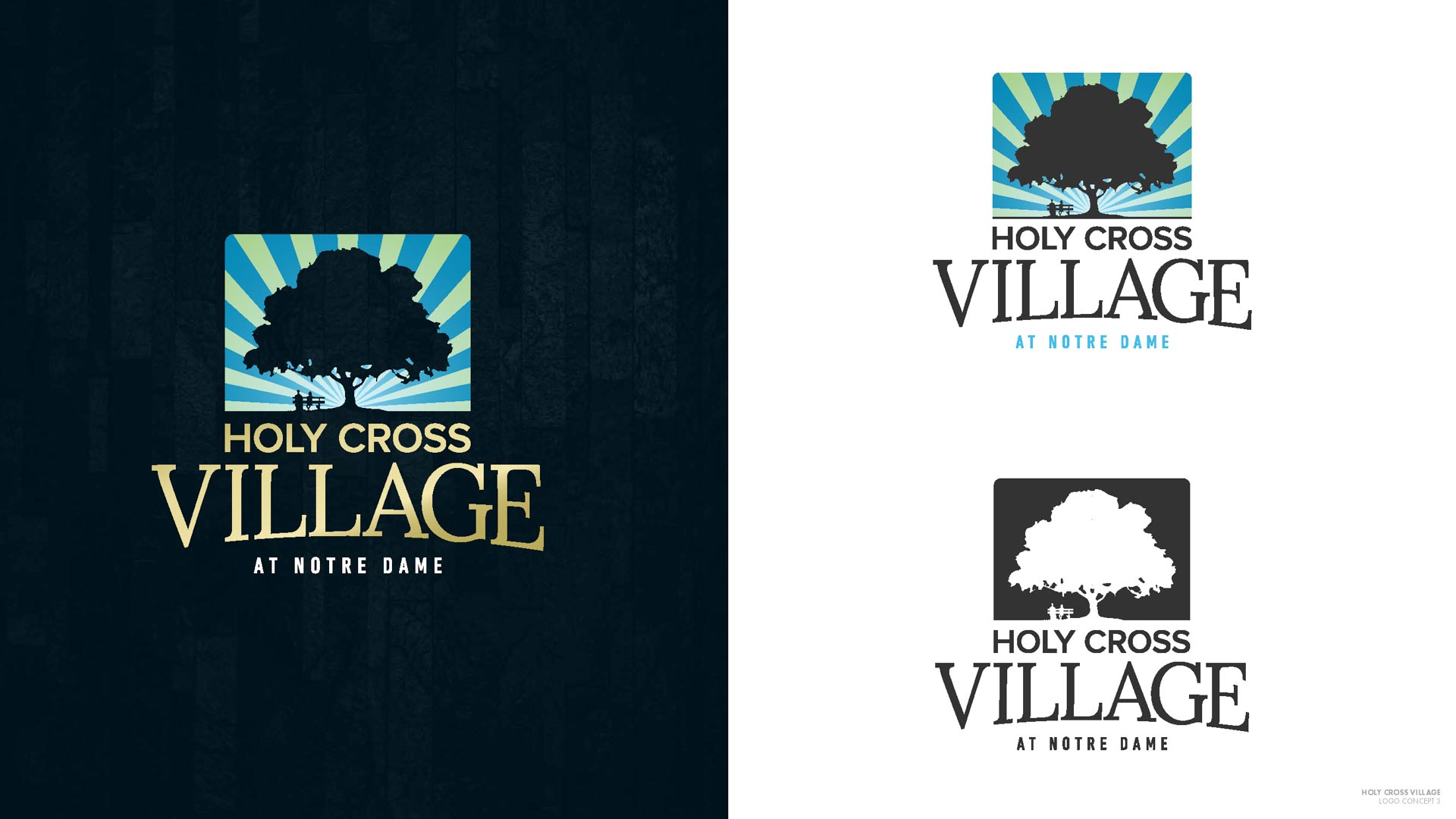
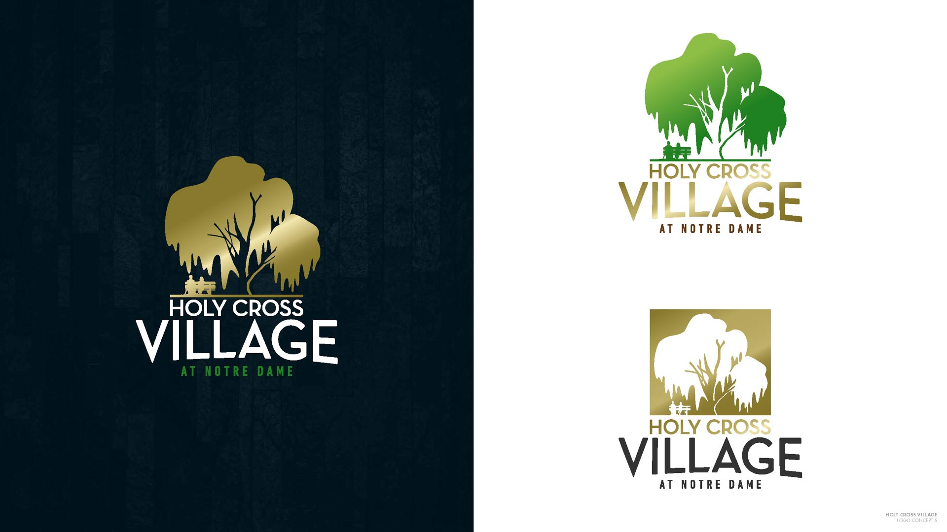
On the other hand, the tree from the original logo was something the team at HCV didn’t want to lose. We started to experiment with the presentation of the tree, color variations, font faces, and presentation formats. After brainstorming and a series of meetings, we decided to add a couple on a bench under the tree, which was an instant fan favorite. Using Holy Cross as the textual “roots” of the tree also made the vertical version of the logo the new primary.
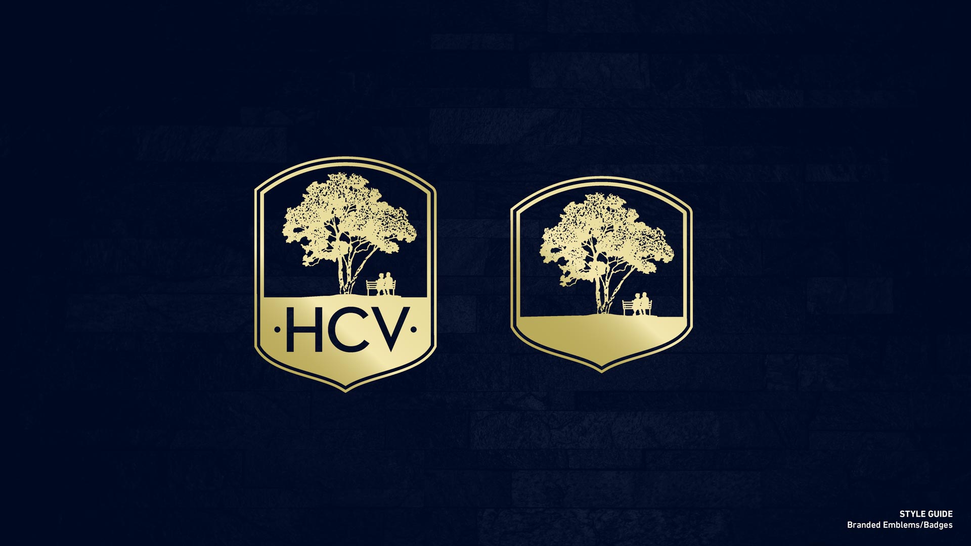
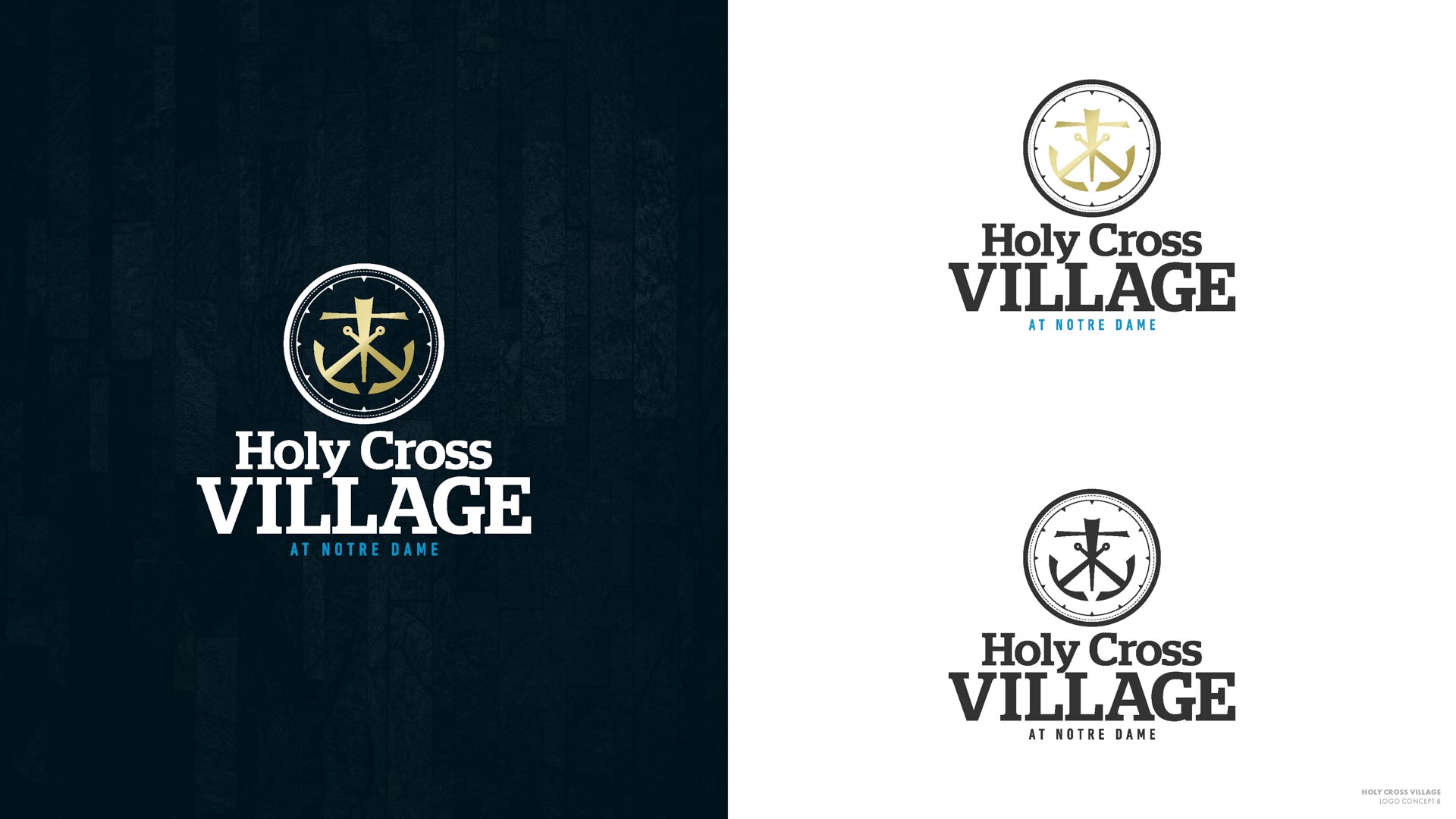
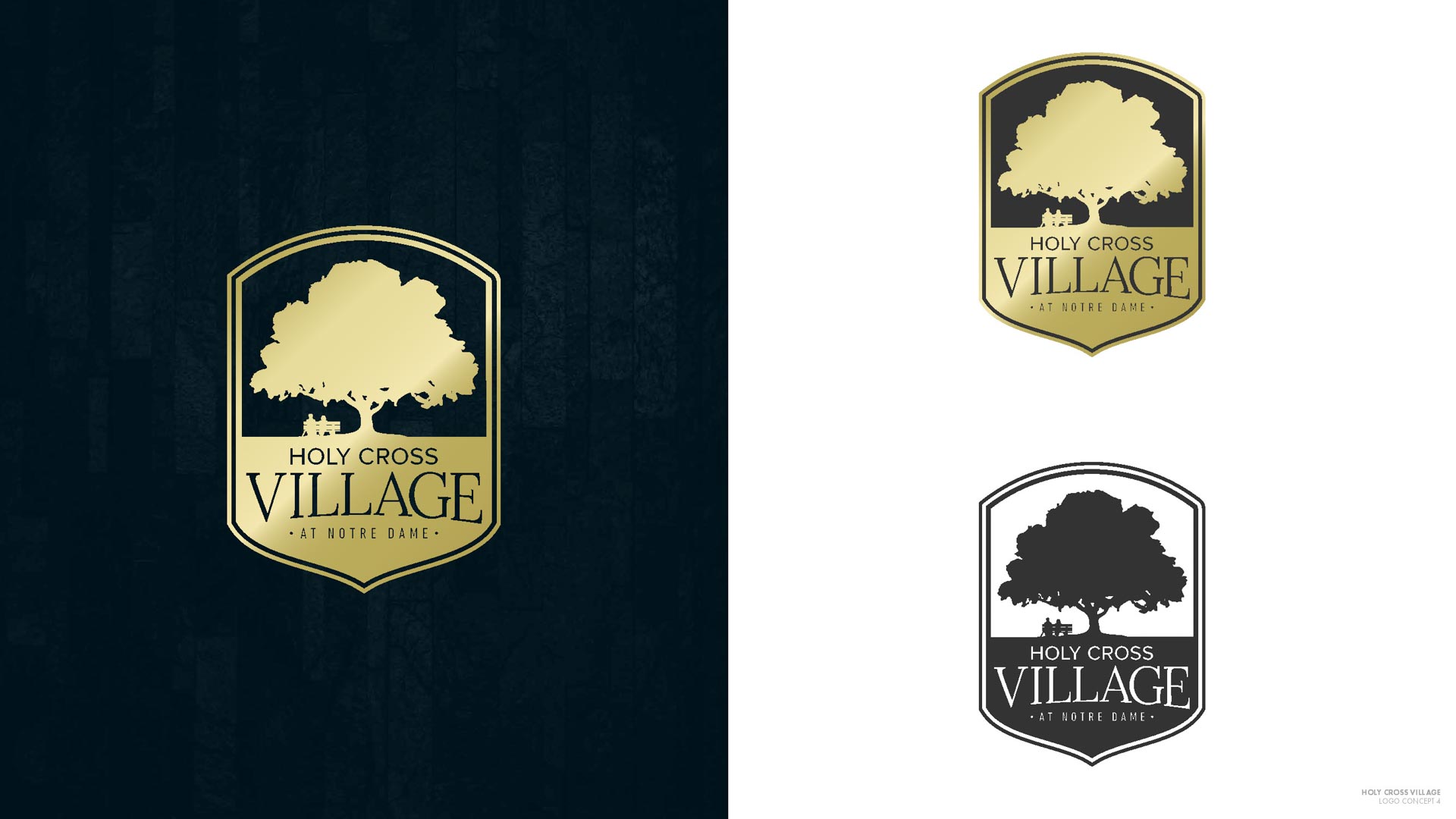
At this point we began to consider variations. HCV particularly wanted to try containing the updated mark inside of a shield that we experimented with in round two:
Round 4
After polishing up the previous round, we presented the work-in-progress to an HCV focus group comprised of the board, a handful of residents with design backgrounds, and a couple of the Brothers of the Holy Cross. Our initial typeface was Neutra, a classic modernist font inspired by the architect Richard Neutra. This turned out to be highly controversial. We had a 50/50 split between love and hate it, with zero in-betweens. The haters didn’t like that we had migrated away from the ornate cursive of the original V and wanted to see that aesthetic incorporated throughout. They were also attached to the tree from the old logo, and wanted to transition from old to new logo more seamless and less controversial. As disheartening as it can feel to go backwards in the design process, it’s sometimes necessary to arrive at something everyone can be proud of.
Final Branding Assets & Guidelines
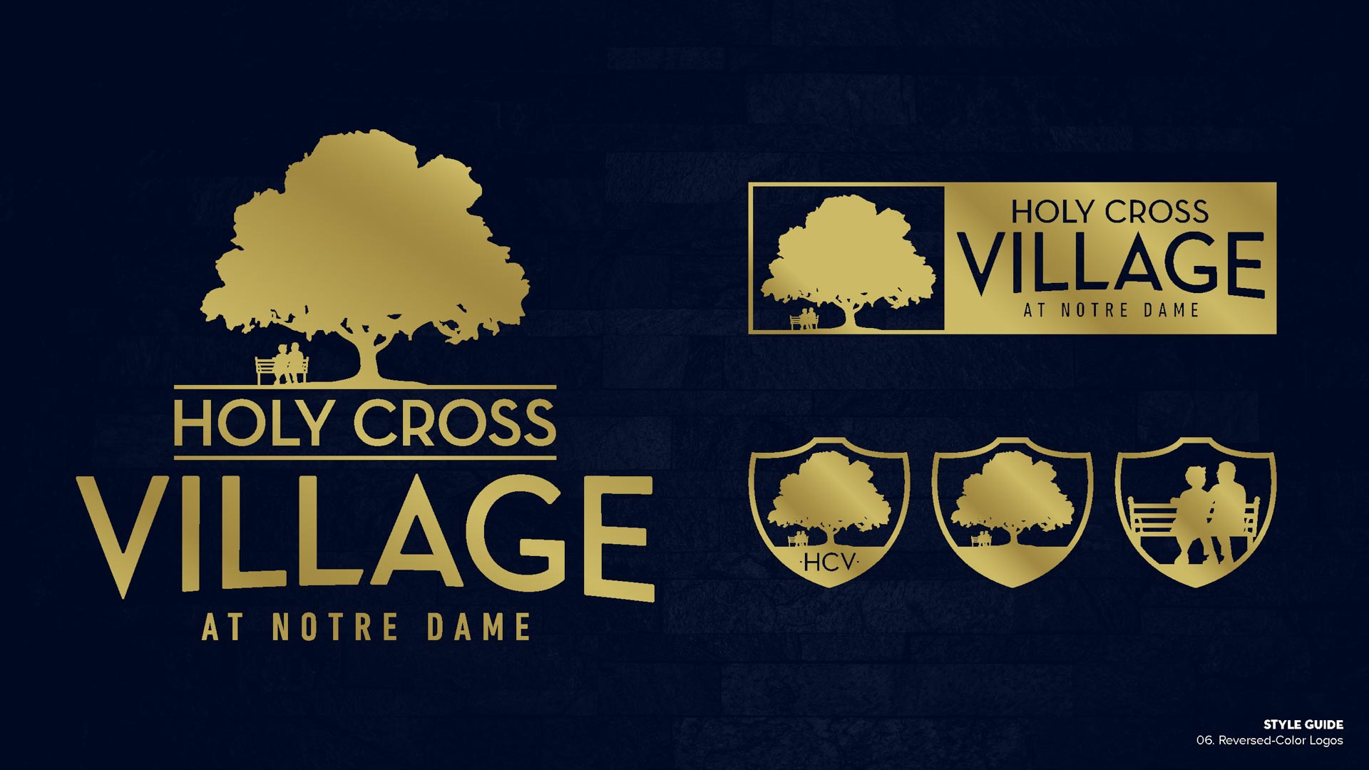
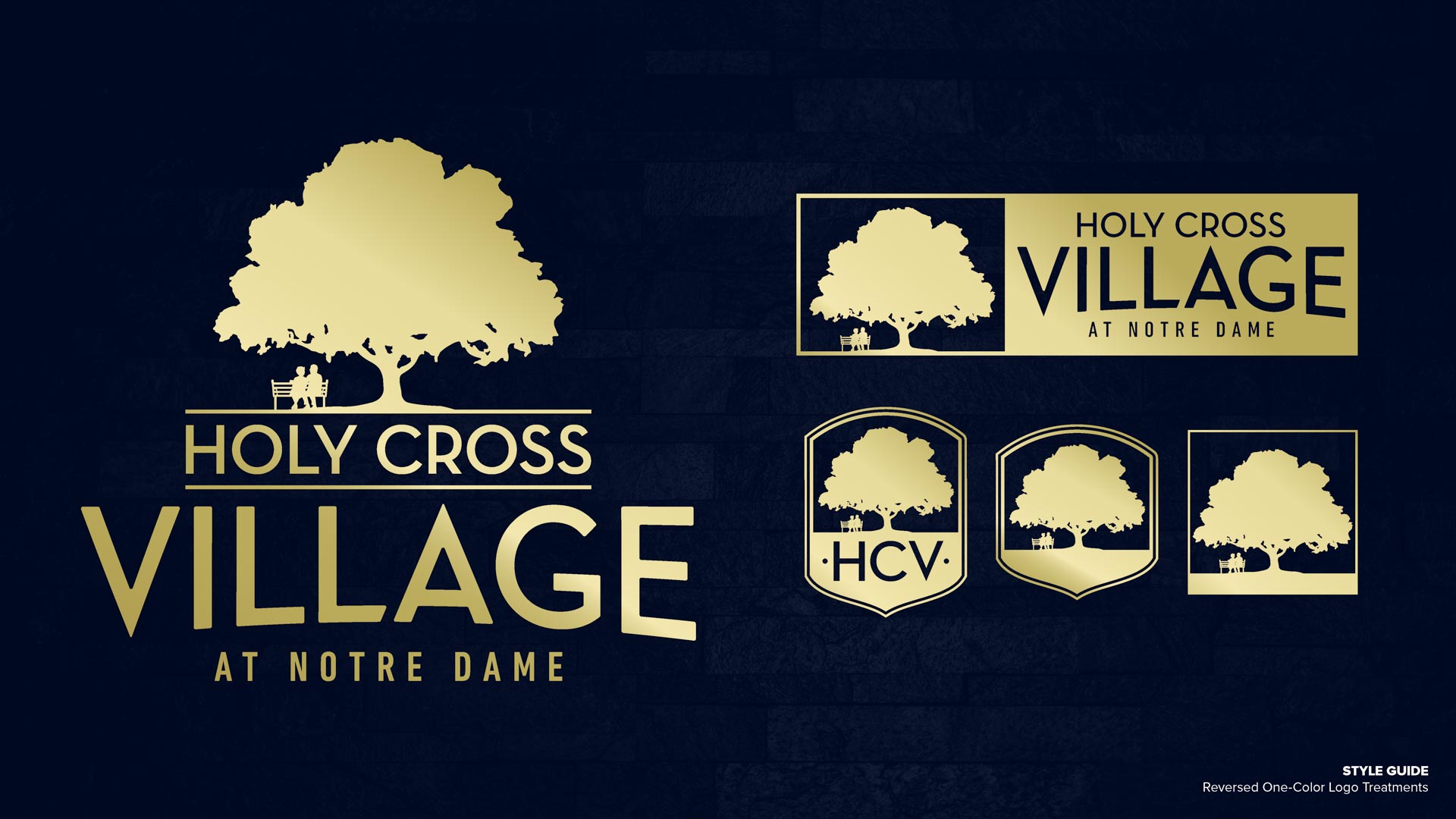
Taking all of HCV’s feedback into account, our next iteration concluded with this result, which was met with enthusiastic approval.
We’ve since been rolling out the new branding on project-to-project basis, working closely with HCV’s awesome internal marketing team. We’re still on retainer to develop business cards, advertisements, and other content, and perhaps more importantly, training their team to work independently of us whenever possible. After all, it’s cheap to print, but it’s not cheap to design. Their internal team quickly learned that they don’t have to be certified Adobe grandmasters to update our user-friendly templates, and now the training wheels are coming off. Our training in particular has already saved HCV thousands of dollars, and will continue to save thousands more in the long run.
Branding the Giving Voice Foundation
Branding Project Overview
Christian Gausvik, M.D. reached out to us to help him build a foundation. The mission: facilitating intellectual, cross-generational conversations at local events to bring awareness to issues facing seniors and their caretakers in Cincinnati. Christian’s original idea was inspired by seeing his patients gradually lose their life stories and experiences in memory to Alzheimer’s. For several years he had been hosting local Cincinnati charity events with his husband, Cody Gausvik, and they were growing very quickly. They wanted to develop their own foundation from the ground up, funnel all of their hard work into one place, and make a direct impact locally. So we went over to their house to have a naming party for the foundation and learn more about their story. It turned out to be the exact kind of local partnership we both wanted to be a part of. It was and continues to be a perfect fit for our small, family-run companies.
Round 1
Before we connected, Christian was developing a logo with a volunteer who wanted to build their portfolio and gain some real-world experience. When you’re creating an organization from the ground up, there are always extreme budget restraints, so I’m always an advocate for doing things cheaply. But a classic dilemma resulted: you get what you pay for. When you have an inexperienced designer taking a crack at something, you’re probably not going to be satisfied with the final result, especially on a tight turnaround.
Meanwhile, I was building the Giving Voice Foundation’s website while waiting on the new logo to be finalized by the volunteer designer. Christian confided that their work just wasn’t hitting the mark. Under more relaxed circumstances, we might have been able to make things work with the volunteer, but we were running out of time prior to the our website launch. As the deadline loomed, I did some quick mockups of possible Giving Voice logos with the intention of winning Christian over. Normally, I don’t move forward with designing a logo for a client without a payment agreement up front, but under the circumstances, something had to give. Fortunately, he liked what we brought forward, and we were quickly off to the races.
We had some rough themes to start:
- Bronze + Teal or Blue + Teal Colorings
- Thin fonts
- Ginkgo Leaf / Tree
- Giving Voice Foundation fully spelled out
- GV as an icon
- …or a mixture of the two
Ginkgo leaf is used extensively in helping with memory loss, and the species of tree itself is the oldest in the world. It immediately felt right to incorporate in the foundation’s logo.
Round 2
Since Christian’s foundation is built around the community of people that attend his events, it was important to not only create a mechanism to get feedback from everyone involved, but make that feedback actionable and productive.
We asked Christian to provide us with his initial unfiltered feedback on the first round of concepts, and encouraged him to solicit the opinions of his family and friends.
To summarize their first round of feedback:
- Fonts needed to be thinner and cleaner looking. Clean became the principal focus.
- Could the leaf be more “brain” looking?
- Multi-hued blues felt right as a color palette.
- No one was 100% in love with anything yet.
To make a long story short, we first explored combining a leaf and a brain, and then experimented with making the brain look a bit like a speech or thought bubble, which would represent the intellectual discussions they were inspiring at their events.
We played with busier leaf concepts, but the ones that really stuck out were the clean brain + leaf + speech bubble icons towards the end of the gallery above. When I sent the next round off to them, it was love at first sight.
Round 3
When working with branding, in every last round of iterations we try to include two main ideas–it tends to get us to 100% certainty when selecting a final logo concept. The leaf/brain icon was lovely, but a bit too busy. Keeping things clean was still paramount.
Deciding Colors, Fonts, & Social Icons
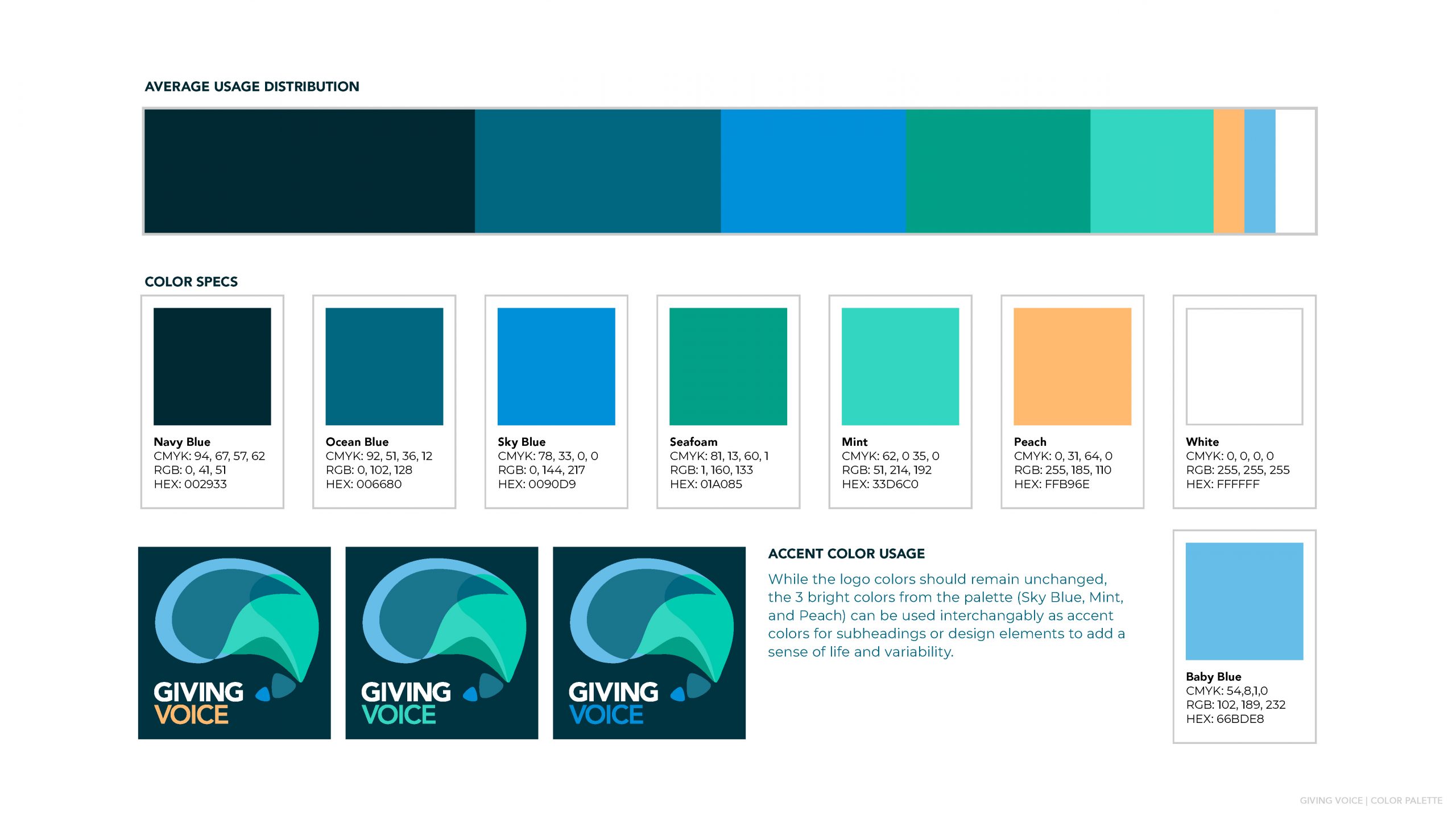
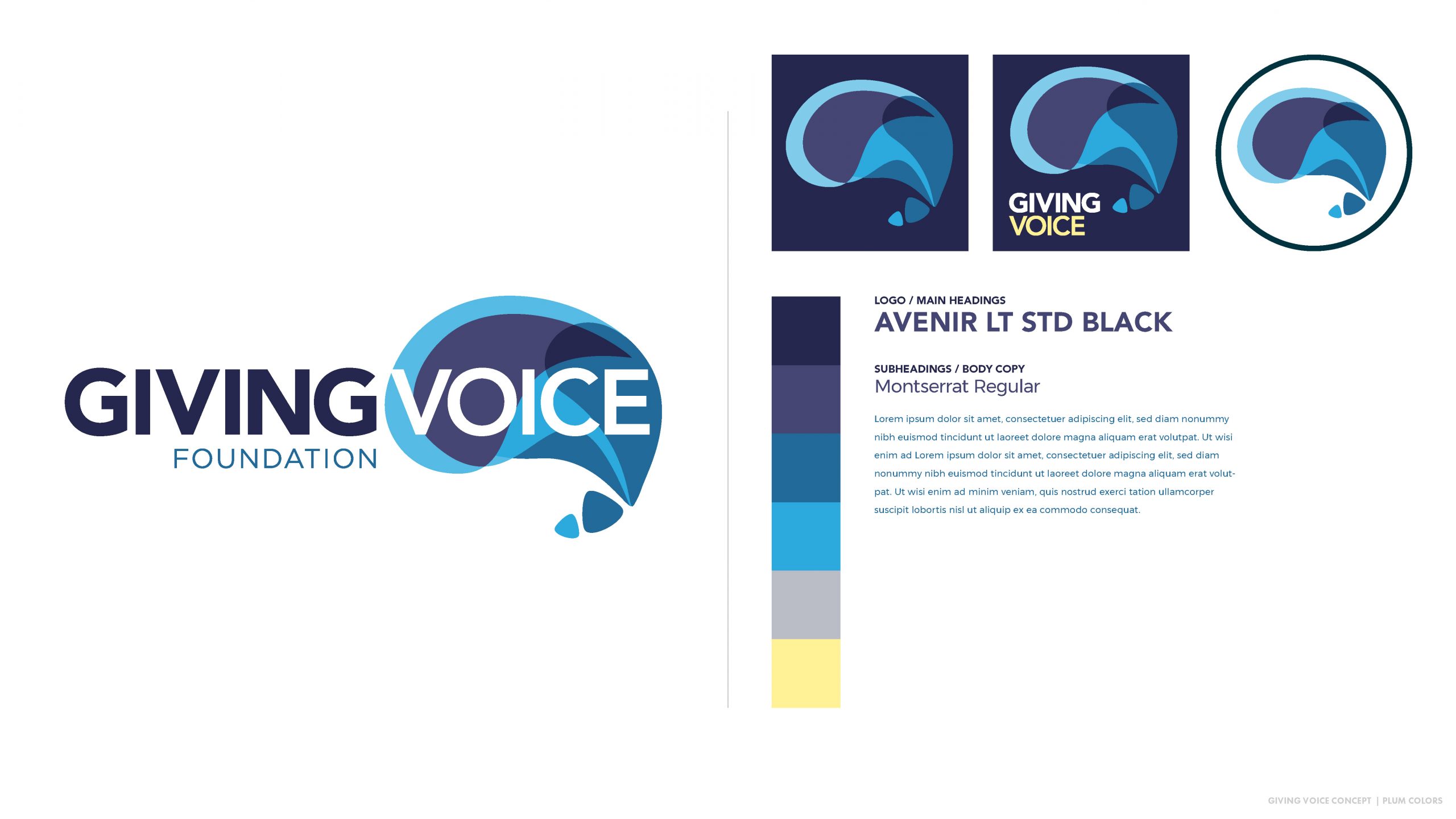
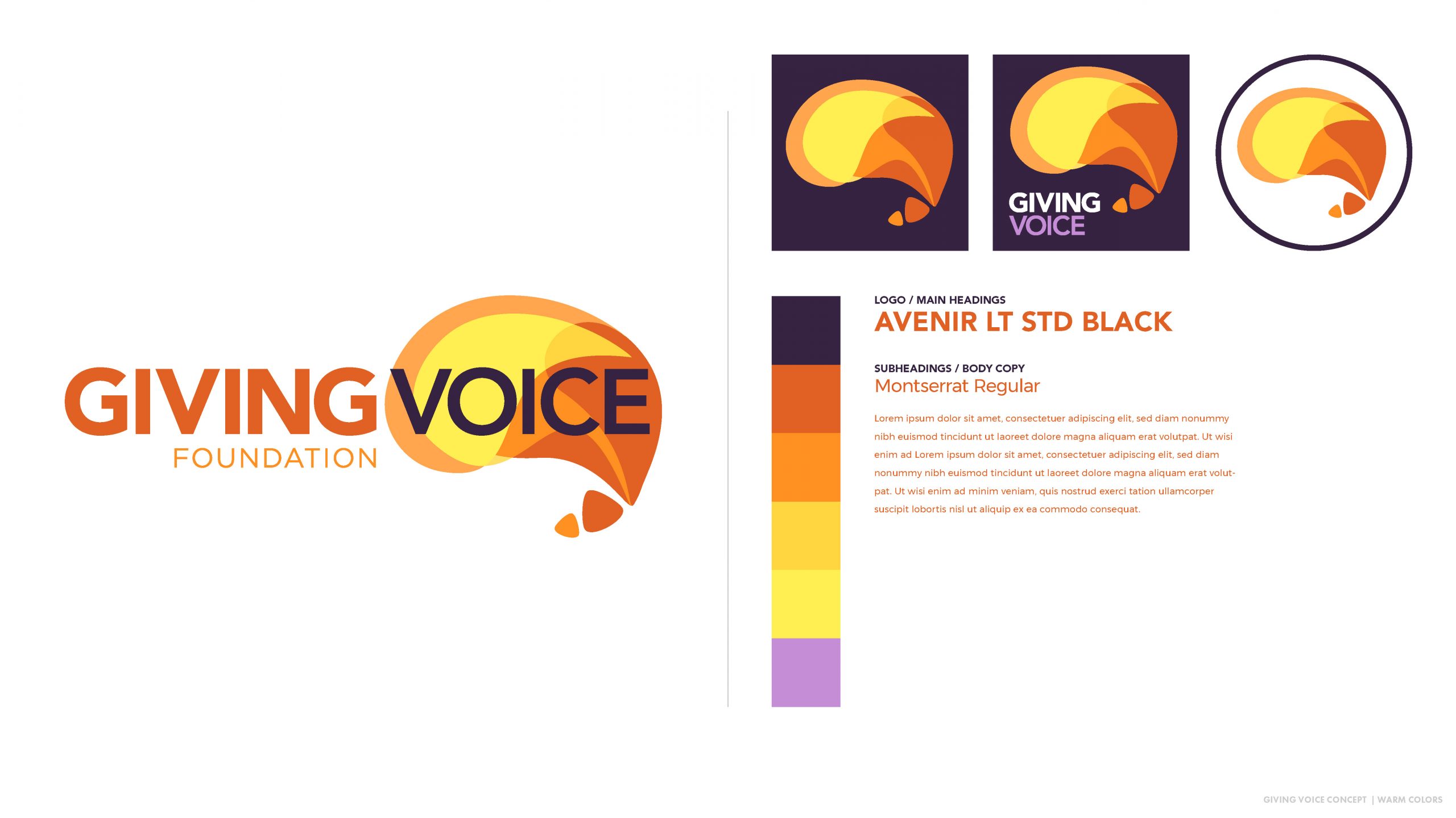
After more iterations, we started to finalize the colors, solidify font pairing, and lay out social icons. The mixture of blues/teals ended up being the winner, but it was fun for the GVF team to consider alternatives.
Final Master Branding Guidelines
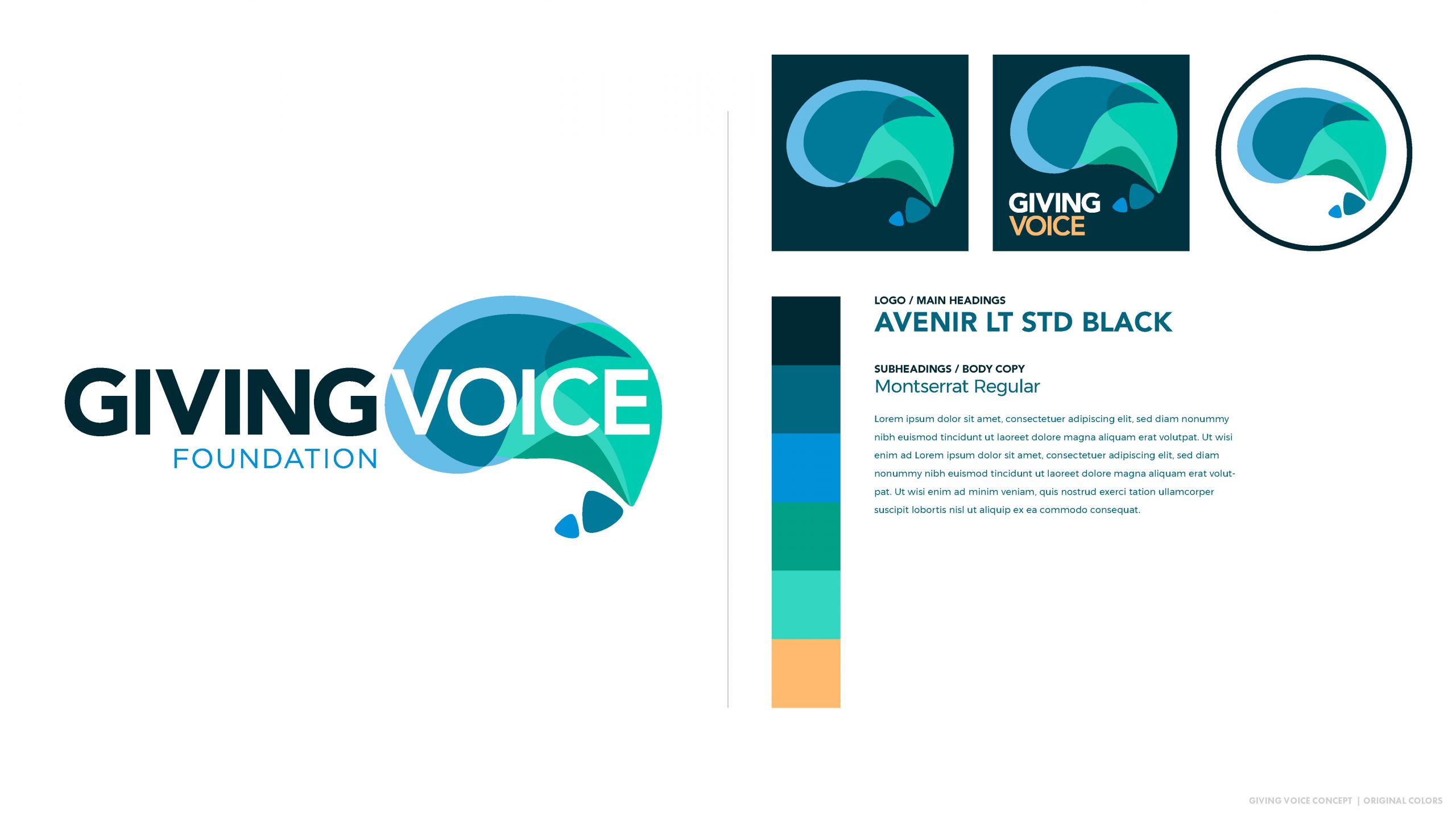
The images below include the master branding guidelines provided after everything was finalized. These continue to make it easy for GVF to collaborate with third-party vendors, merch producers, outside designers, and future employees as the Giving Voice Foundation grows.
Rebranding Montessori Live
Our rebrand project with Montessori Live, the first online certification system for Montessori teachers, flowed out of our deep involvement with Montessori Edison Lakes. Because we came in speaking the same language, we were quickly able to determine the scope of challenges and what precisely they needed help with.
We settled on three main priorities:
- The brand needed a modernized design, look, and a unified marketing narrative.
- The website needed to be completely redesigned to match these new standards.
- Their third party e-learning environment would need the same treatment, if possible.
Creating a new company logo is an iterative process, but it’s a lot of fun for those involved. There’s something special about being a part of the process of branding your organization as an employee. It’s a visual representation of what you stand for. It gives you more pride and ownership in every bit of work you do. We get a lot of joy out of seeing this happen with the passionate business owners and teams we work with. The goal of the process is to end up with something everyone loves and can be proud of. There’s no settling when it comes to creating your company’s logo. Everyone involved needs to feel good about it, including us!
We begin every rebranding process getting everyone on the same page about what constitutes good design. In the process, we’re able to align our expectations, revisions, and final outcome. During the educational portion of our process, we learn everyone’s likes and dislikes. These initial discussions, along with more direct follow-up questions from us, inspire the first round of concepts. The goal is to start broad and refine with each iteration. On this project, we ended up starting out headed in one direction, and the discussions that followed led in another, with new and unexpected discoveries with each round.
Round 1
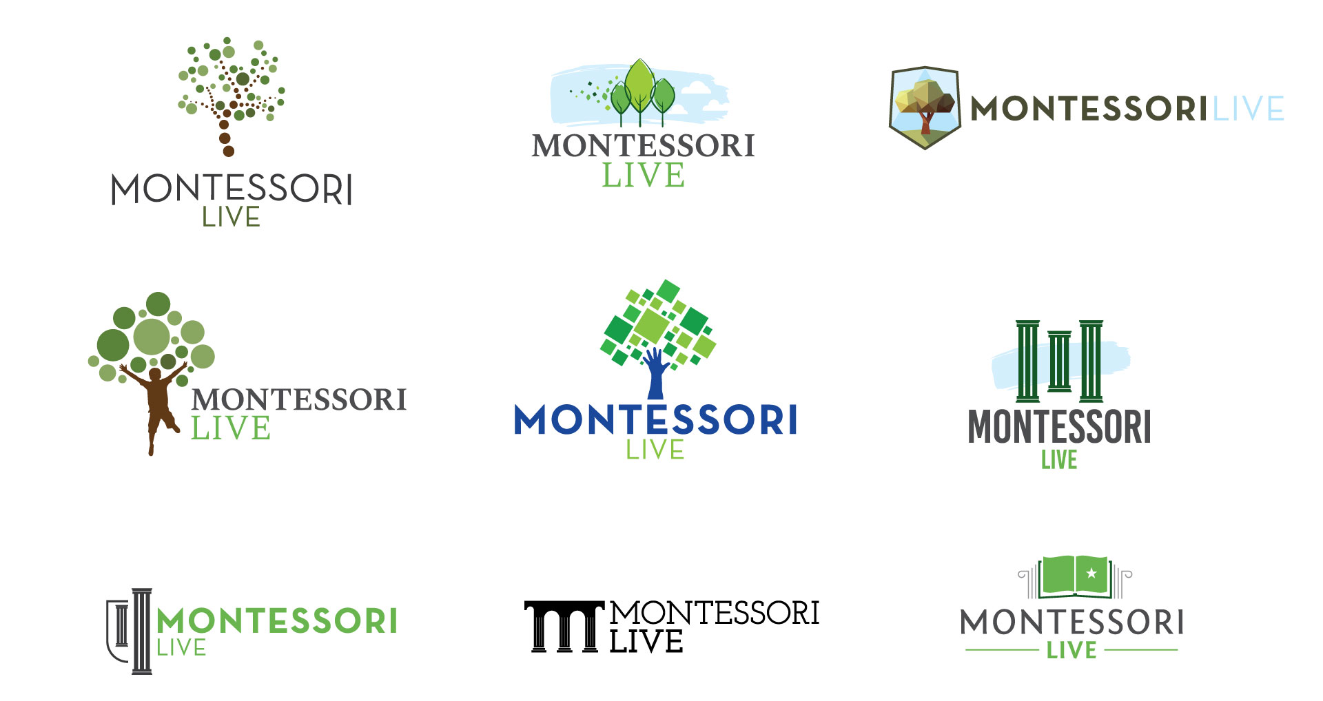
We had a lot of creative freedom at the beginning, and initially pulled inspiration from all over the education industry. While we found lots of trees, hands, shadow children, books, and shields, Montessori Live wanted to retain the pillars from their original logo. We added the pillars in a few of the concepts, even though we thought it’d be challenging to make them fit within the modern design aesthetic we were trying to encourage. Some of those variations are in the top row below:
Round 2
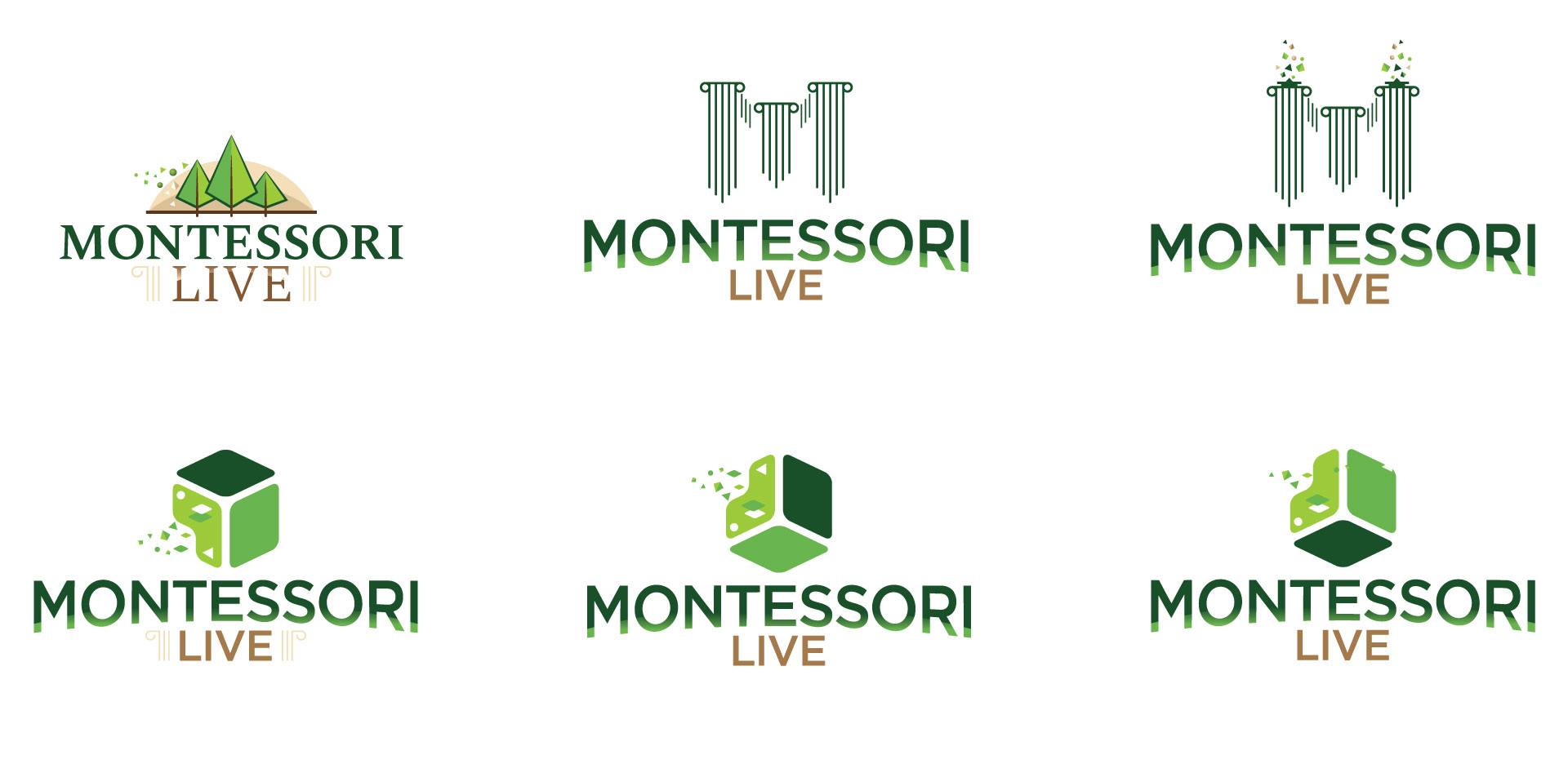
The first set of concepts gave the Montessori Live team a lot to think about. They still wanted to see an evolution of the pillar concept, but we also asked them to branch out and consider other possibilities. Things started to get interesting when they riffed on the theme of well-known Montessori learning materials, of which the cube is one of the most fundamental and ubiquitous. We made a few variations on small pieces gravitating towards a fully-formed cube would stick–see row two, above–but our journey was just beginning.
They asked us to make something involving the famous Pink Tower, below, which was developed by Maria Montessori and is standard in every Montessori classroom. Once their team started thinking of other common Montessori materials, we were off to the races. Their team also proposed working with Nienhuis Beads, which are also standard in all Montessori classrooms as a tactile way to introduce elementary mathematical concepts and especially decimals.
We thought it’d be a powerful visual to take an individual strip of the beads and drop them into water, thus creating a ripple. Metaphorically, this represented Montessori Live maintaining the traditional core values of Maria Montessori–the bead–while they try to disrupt the status quo of the industry by offering an online certification option–the ripple. Now we’re looking at something fundamentally different than the previous round:
Round 3

The discussions after this round led to a more focused mission statement for us to try to encapsulate visually: Montessori is all about finding harmony within the analog world–in other words, nature. We ended up with a lot of variations:
Round 4
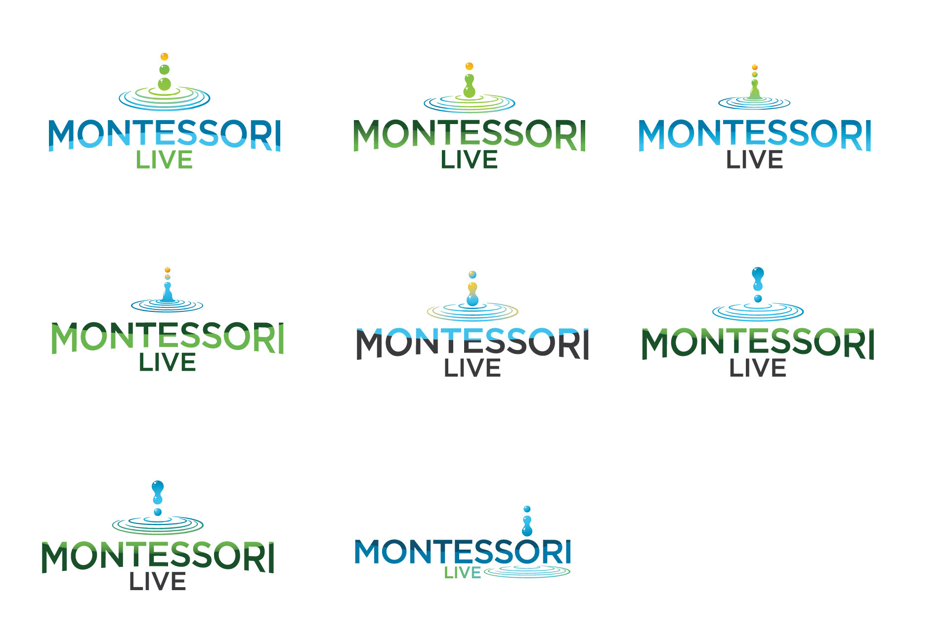
The beads have evolved to looking like water droplets, which is a bit of a logo cliche. We agreed it made sense to try to turn the ripple into a wave.
Round 5
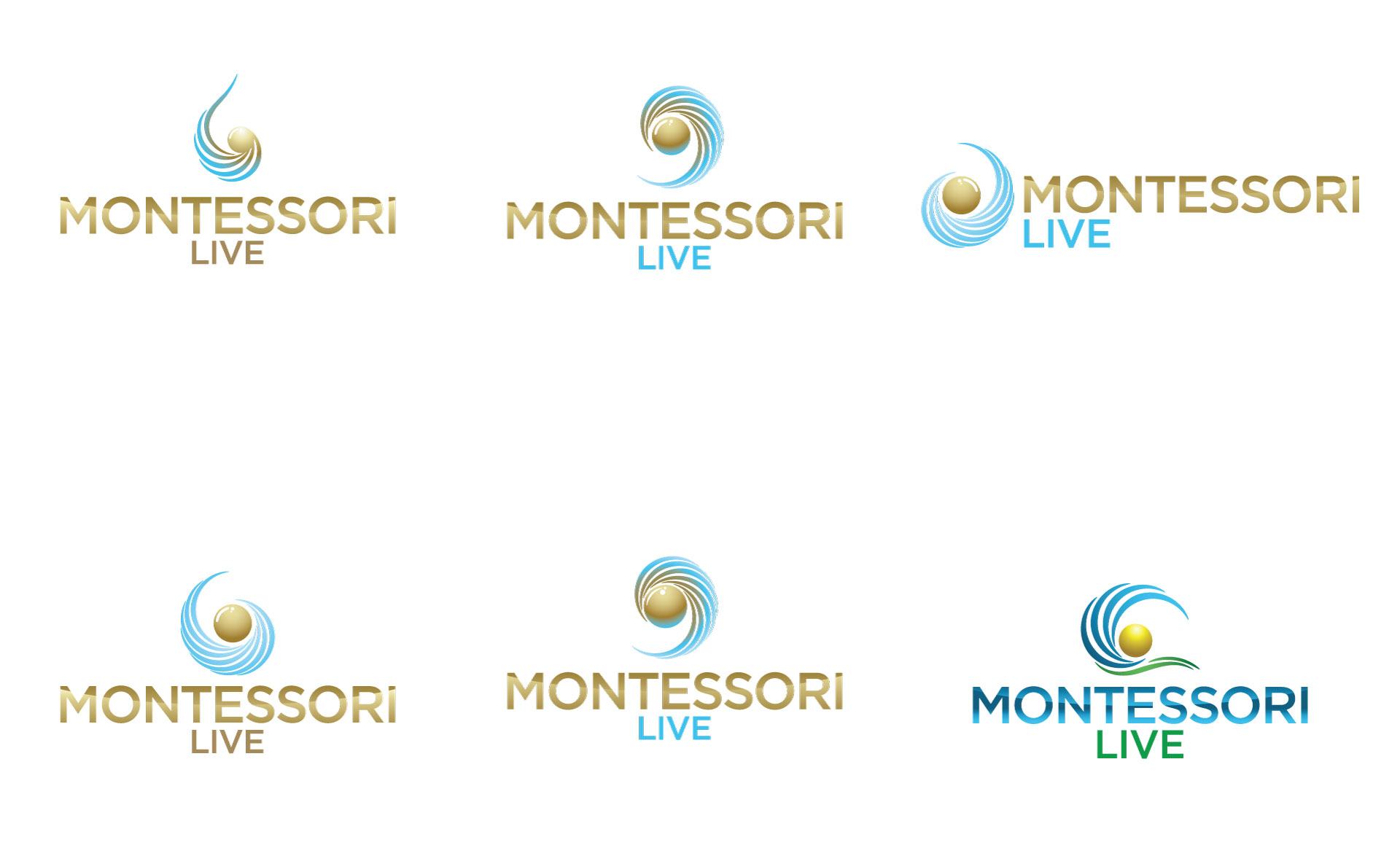
By the fifth round, we were solid on the bead and wave concept, but needed to mold the two into one. We wanted the bead and the wave to appear in the same visual universe, if you will. This would represent the kind of harmony at the core of Montessori Live, and combine all the other cool metaphors we were going for.
And then there were two.
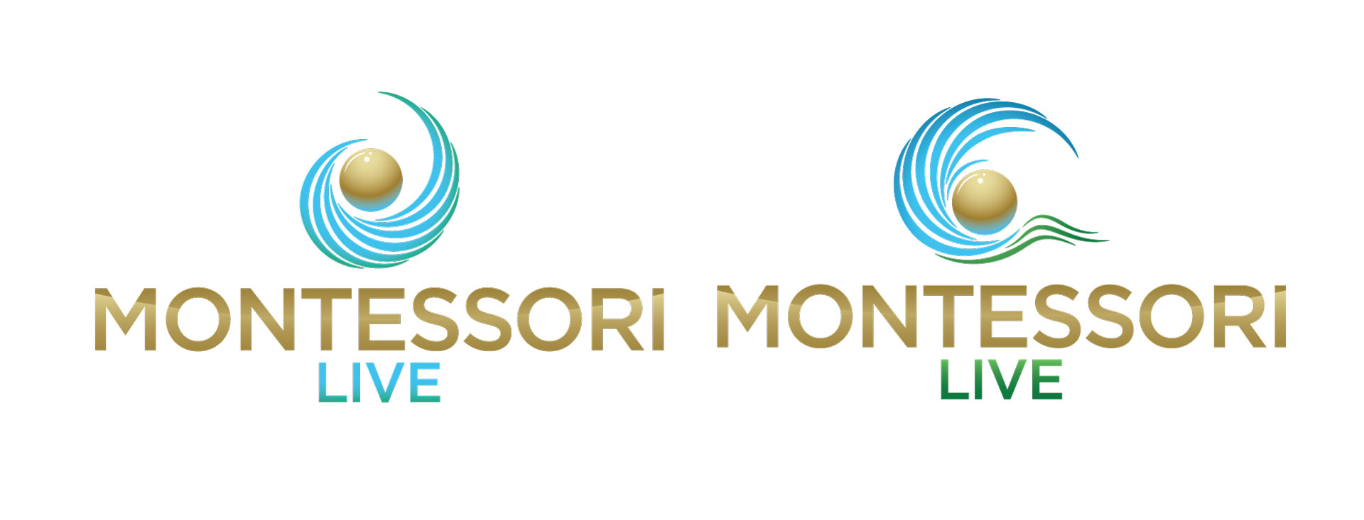
Finally, we were down to two. The variation at left was the clear winner; their team found the variation at right a bit much. Now we just had to add some polish to the winner and create a repository of new digital assets to match.
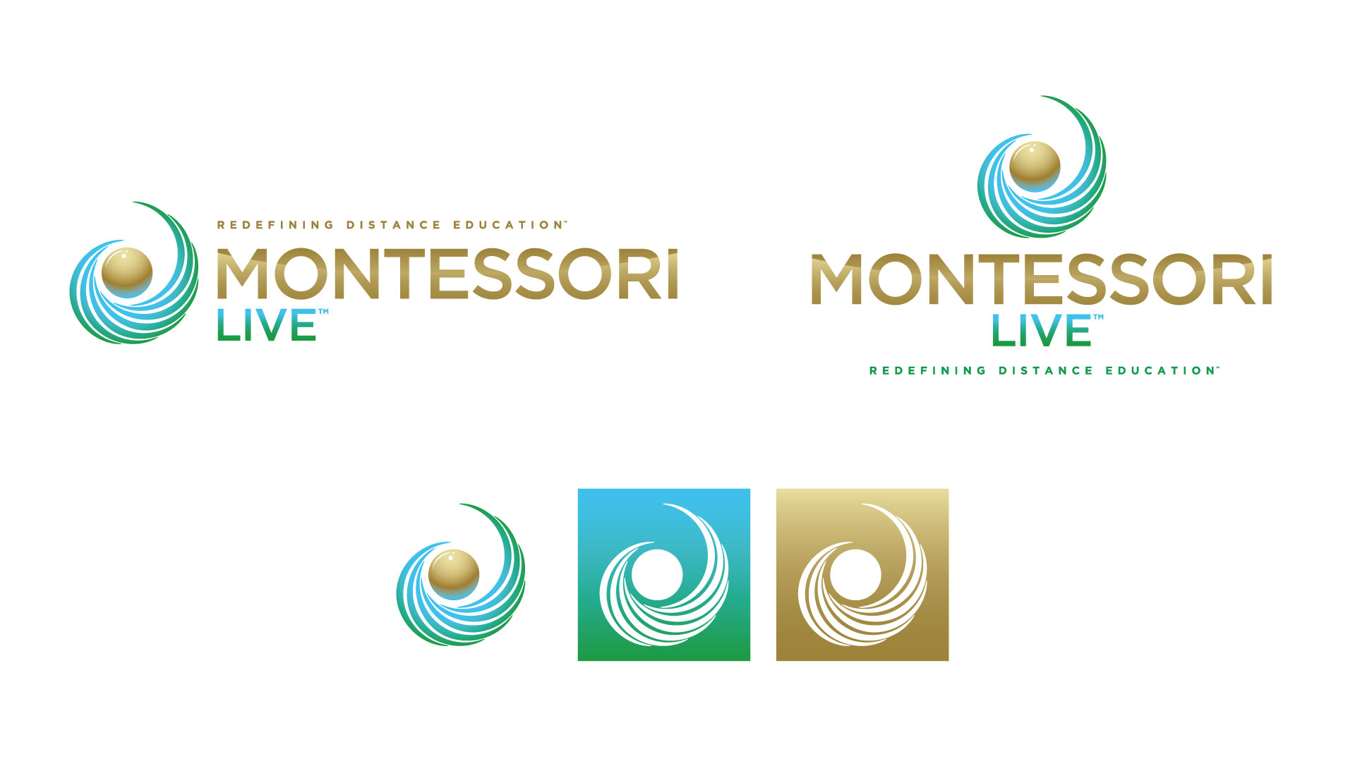
One of the biggest tangible benefits of investing in a rebranding project is that you gain customizable branding assets that look good on everything. The majority of small businesses, nonprofits, and schools we encounter tend to have one or two low-res image files given to them by a marketing agency years in the past. Updated digital assets offer flexibility for digital and print: documents, ads, PowerPoint templates, contracts, business cards, merchandise, website, social media properties…it goes on and on.
Above, you’ll see a horizontal banner logo, a vertical logo, and then 3 social media icon variations. We also provided a large repository of document templates, a newly designed student handbook, three different types of business cards, updated certificates and diplomas, a brochure, a one-page handout, and even e-mail signatures for staff members.
All of which can be resized, used on any background, and integrated easily into anything they want to their branding to appear on.
