Project Overview
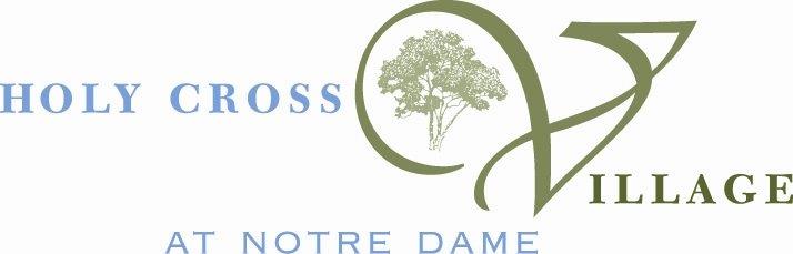
When we first discussed a rebrand with Holy Cross Village at Notre Dame (HCV) in January 2019, they had been using the same logo for many years. No one knew where it came from, how long they’d been using it, who made it in the first place, or why there was a tree inside a cursive V. They only had one low-resolution image file of their logo (below), shared ad hoc throughout the organization. The aged file couldn’t be enlarged to be print much beyond the size of a postage stamp, and didn’t support transparency, so it could only ever appear on a white background. This is a familiar situation for us, and HCV is precisely the kind of client we love to help: one where we can have a big impact.
The first step in starting a complex rebranding effort was to get everyone on the same page. We formed a Digital Integration Team (DIT) with key decision makers from HCV’s leadership staff (CEO, COO, and directors from each department) and met bi-weekly for strategy meetings. The projects we launched ultimately helped HCV reach their full potential, especially with respect to their goal of encouraging greater advocacy throughout their community and organization.
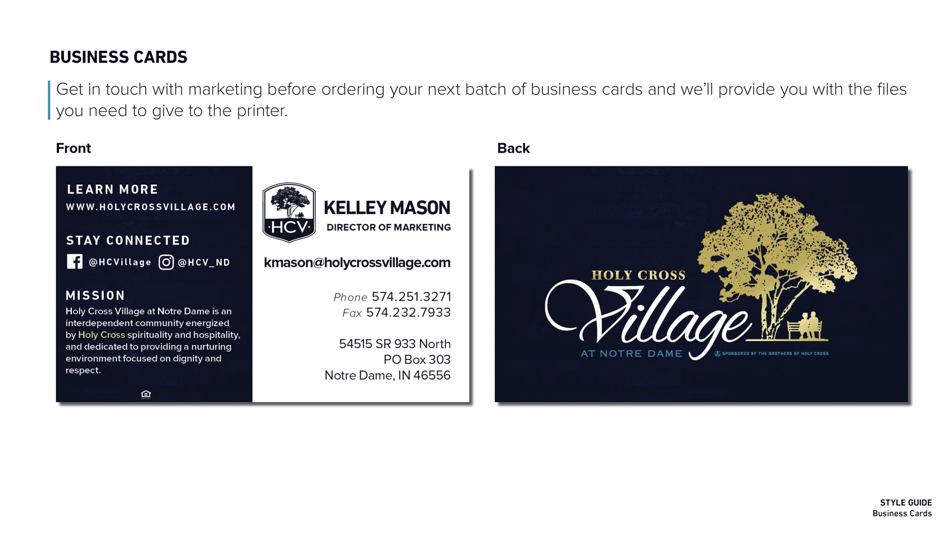
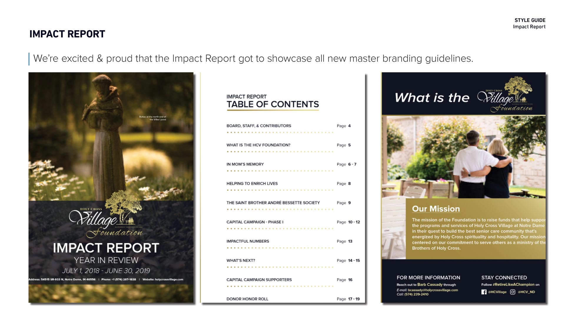
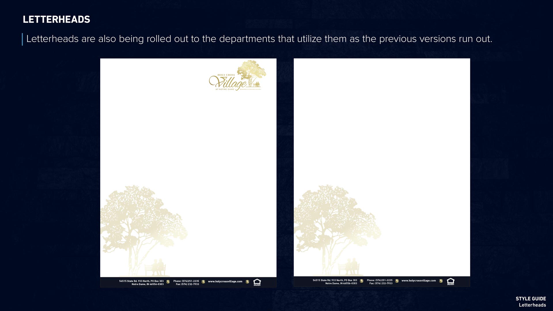
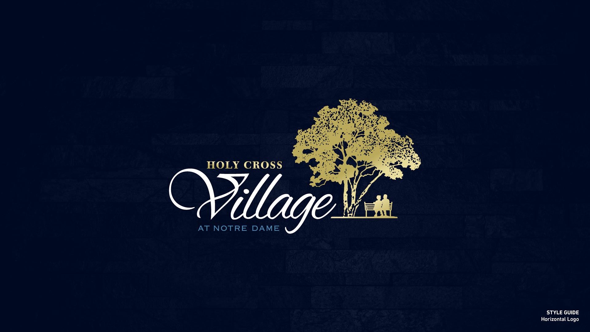
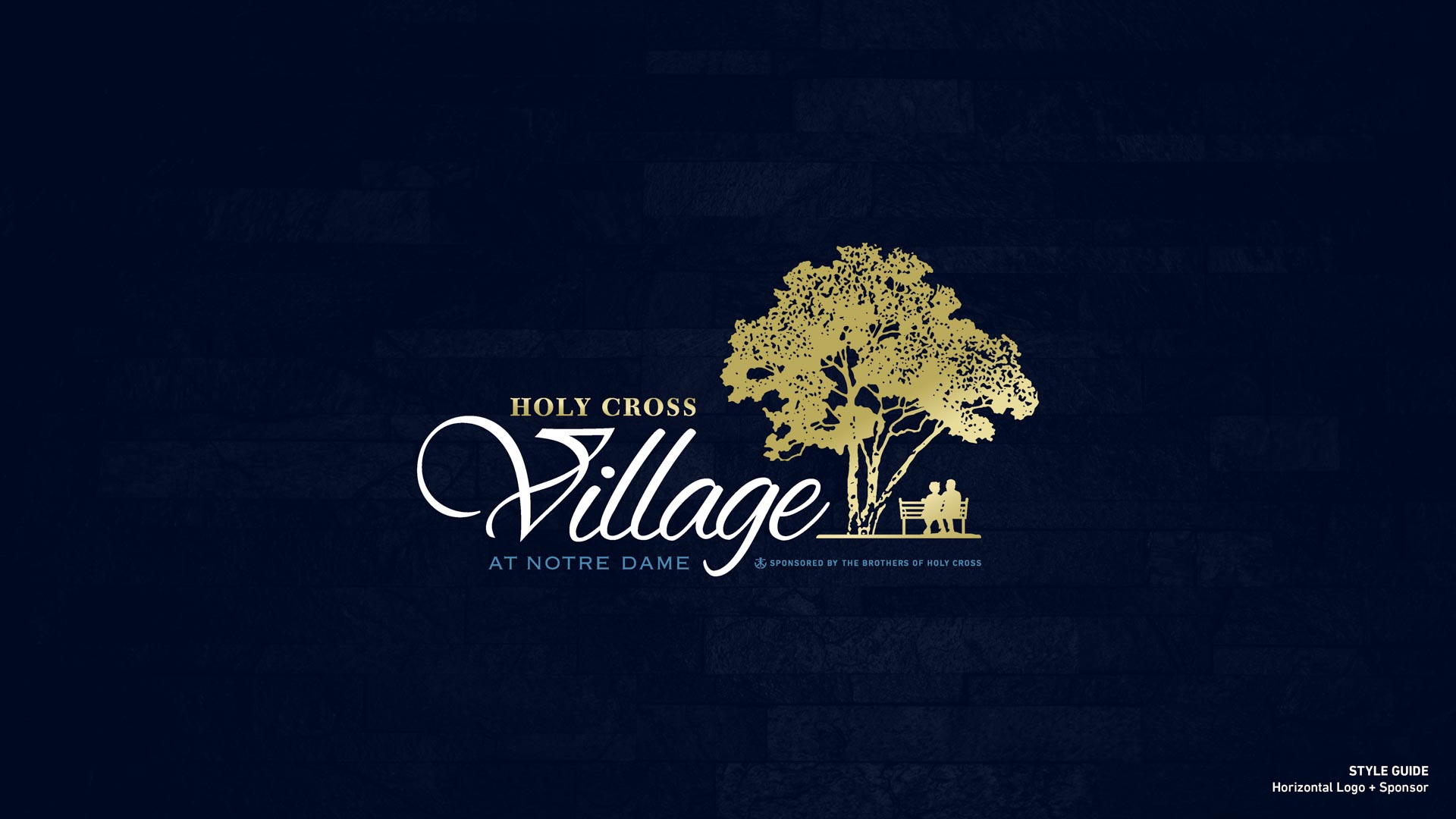
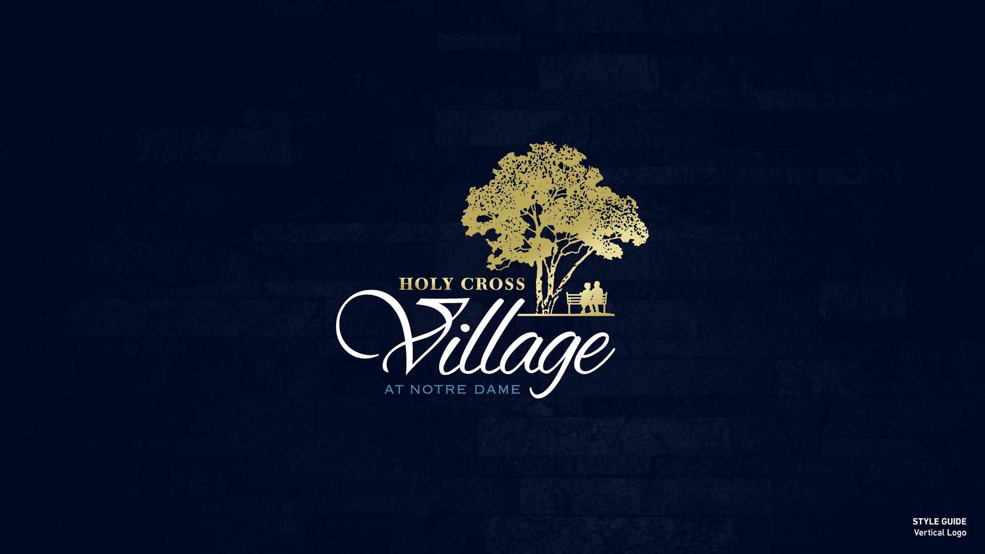
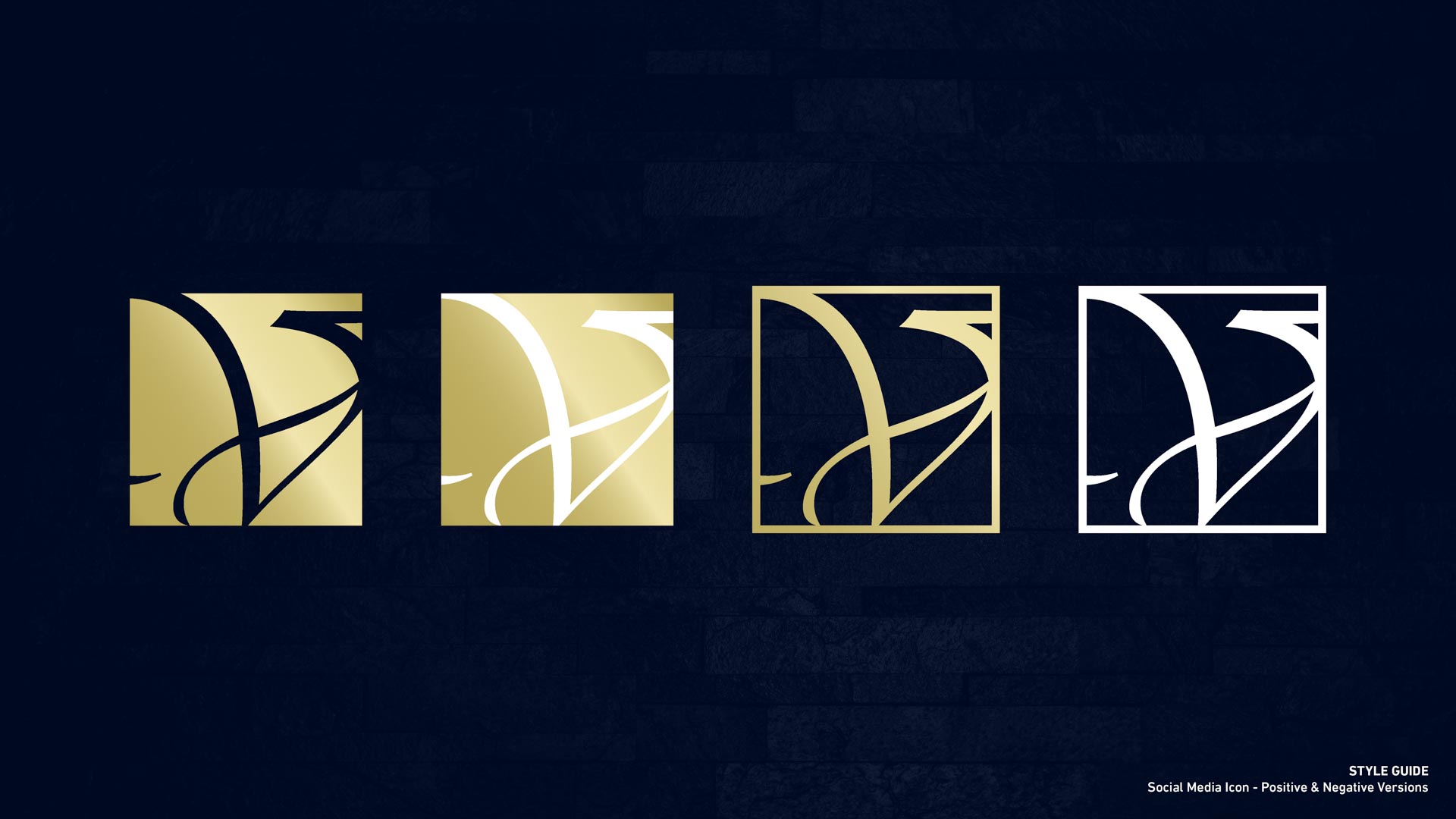
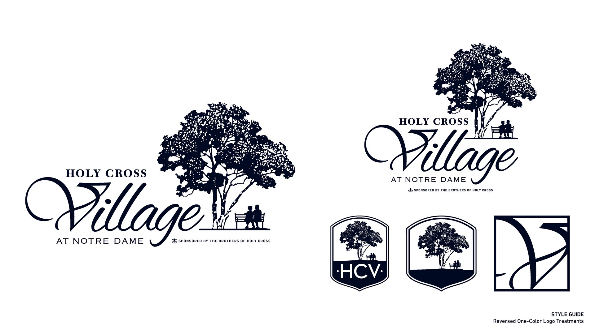
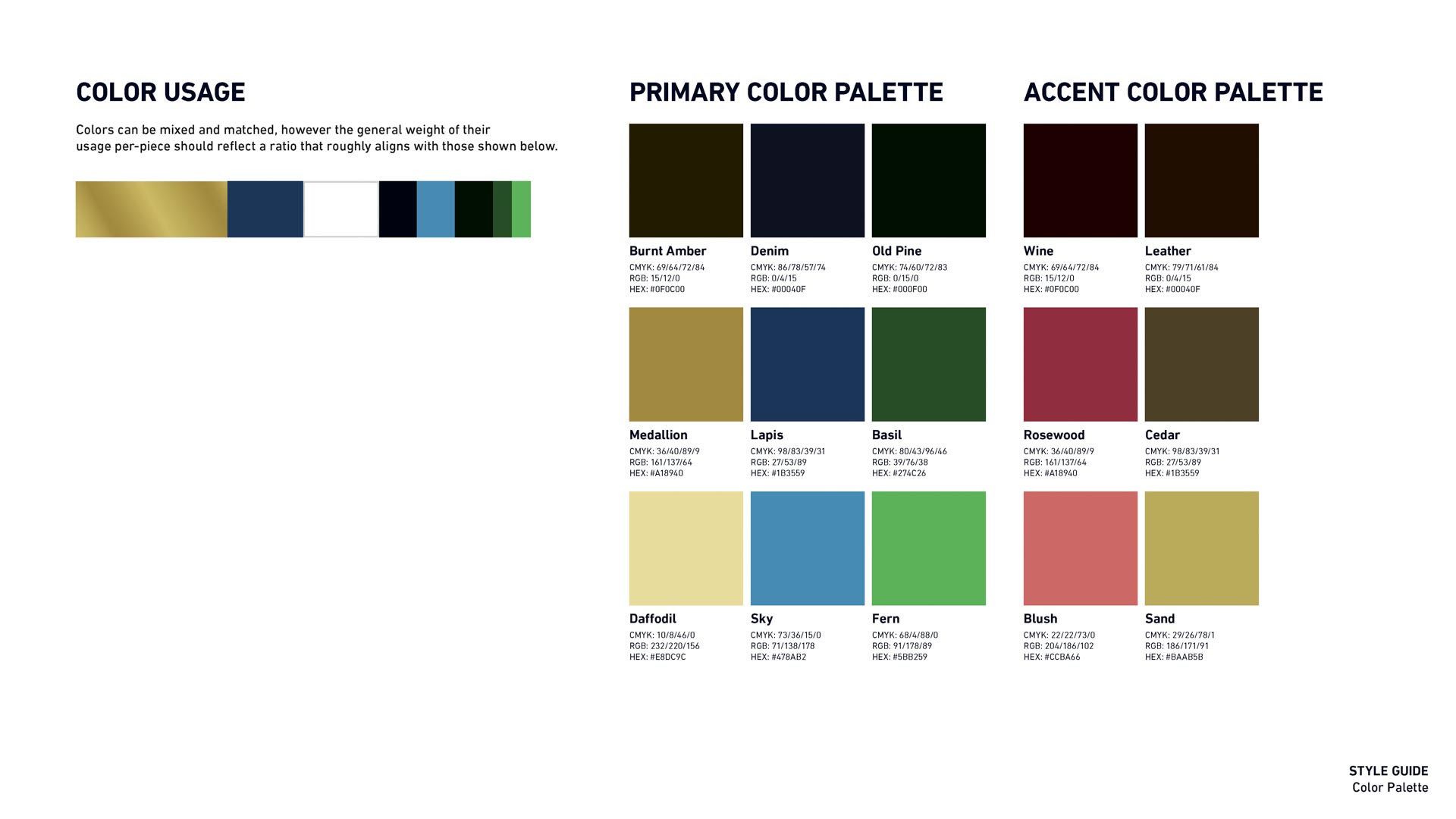
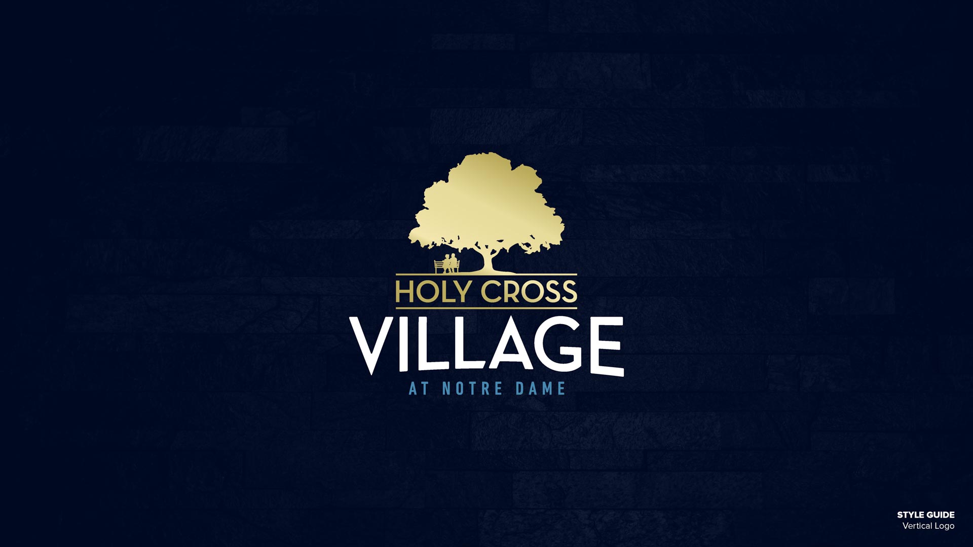
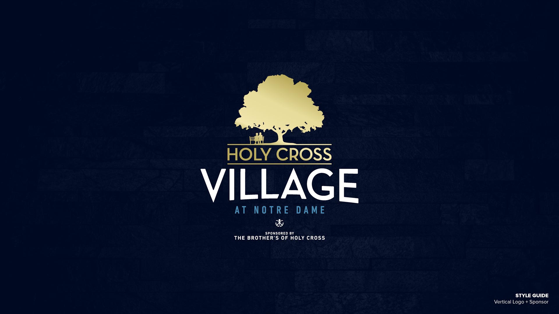
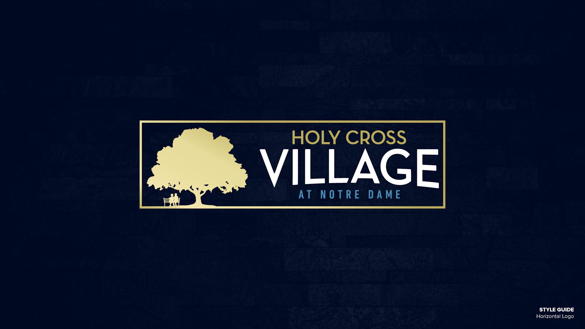
By November 2019 we were ready to roll out fresh new brand and assets: business cards, email signatures, and new, multi-use variations of the logo. Everything lives in a public shared drive that staff can now access and use independently into their own projects. We outlined master branding guidelines in a PDF with situational logo usage, color codes, and typography, implemented policy changes, and trained HCV’s internal marketing team to keep the brand consistent and professional throughout the organization.
Round 1
We started with short, rough list of initial themes:
- Luxury feel.
- The letter V as the primary graphic.
- A tree as the primary graphic.
- A cross incorporated into or as the primary graphic.
The cruciform imagery was ruled out quickly: it’s too intimately associated with (Christian) church. Though the Brothers of the Holy Cross are a Catholic organization, it was imperative not to exclude other faiths in their branding.
Rounds 2 & 3
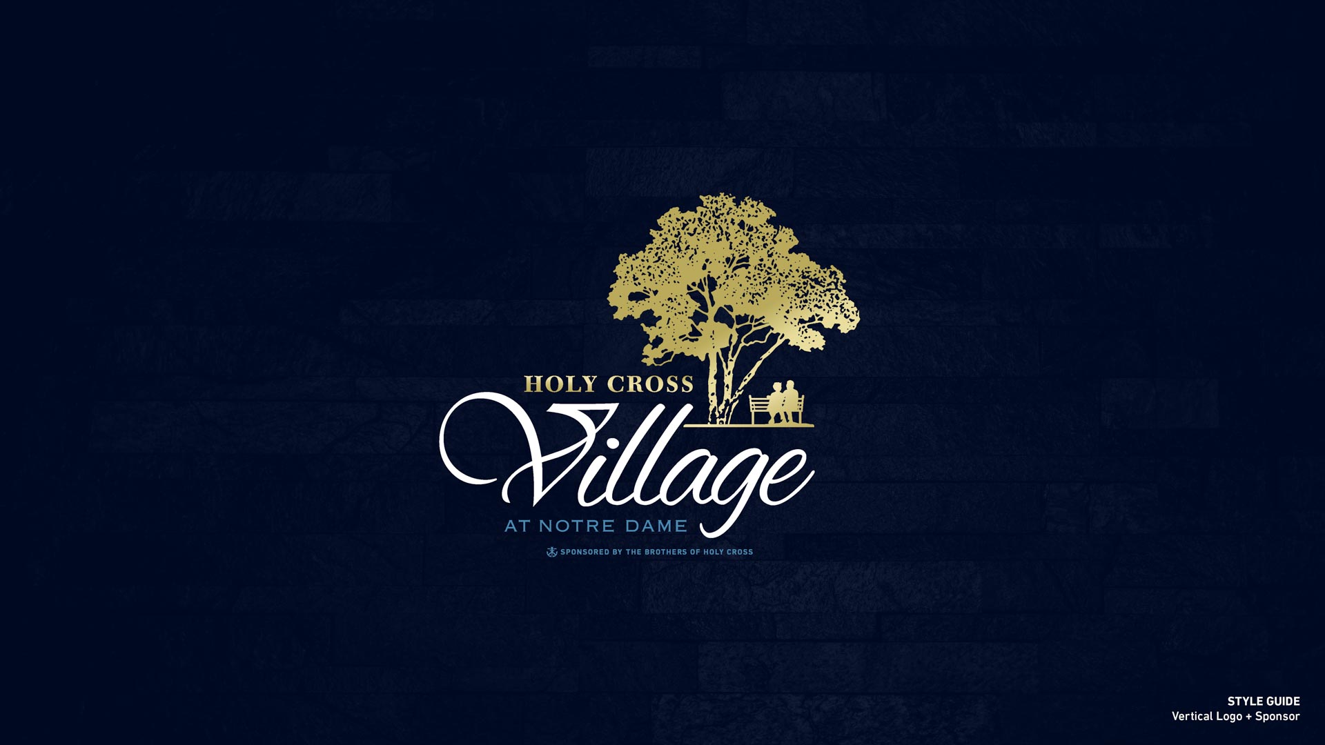
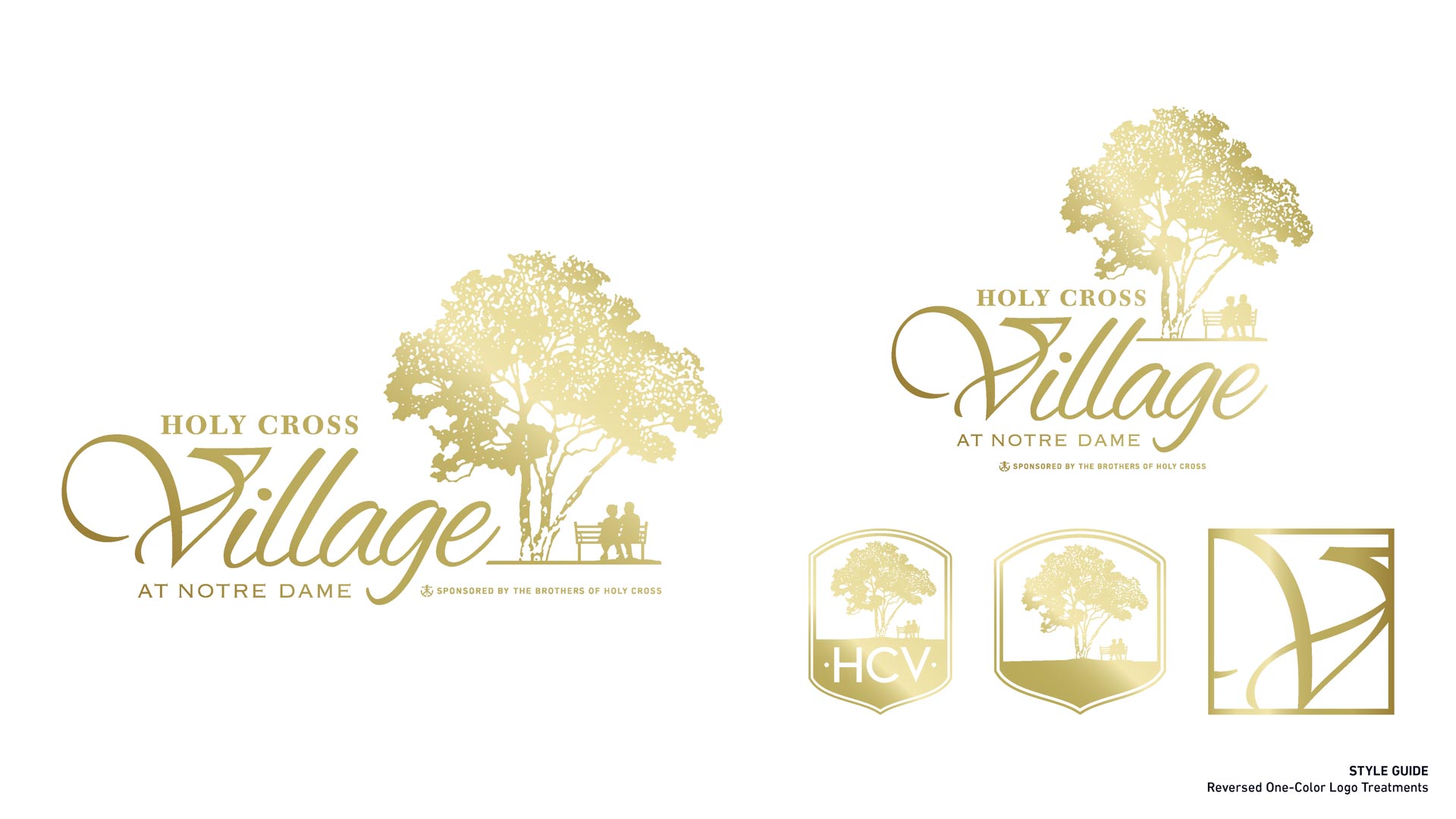
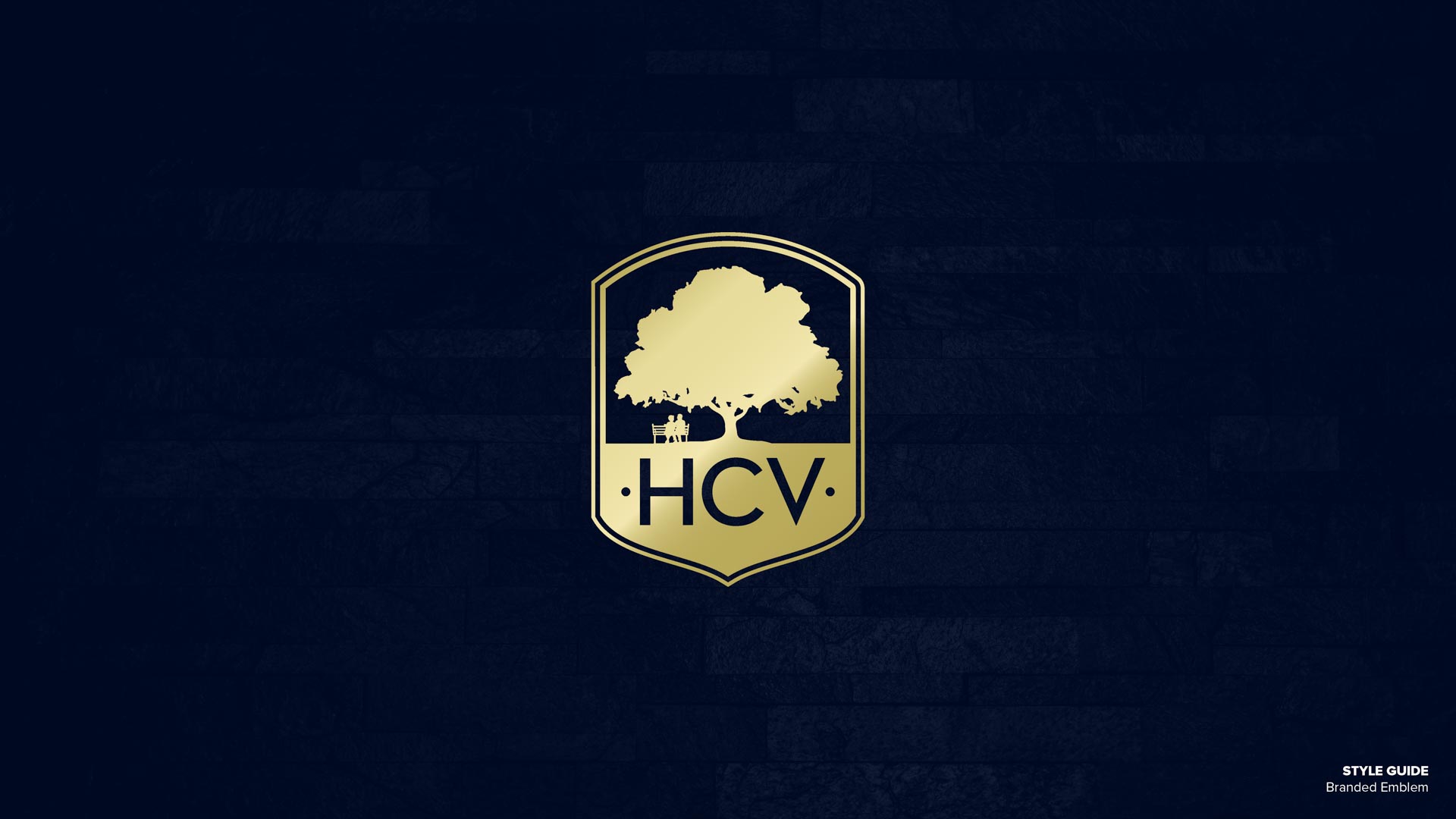
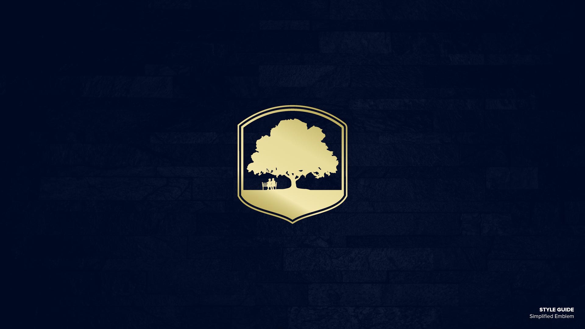
On the other hand, the tree from the original logo was something the team at HCV didn’t want to lose. We started to experiment with the presentation of the tree, color variations, font faces, and presentation formats. After brainstorming and a series of meetings, we decided to add a couple on a bench under the tree, which was an instant fan favorite. Using Holy Cross as the textual “roots” of the tree also made the vertical version of the logo the new primary.
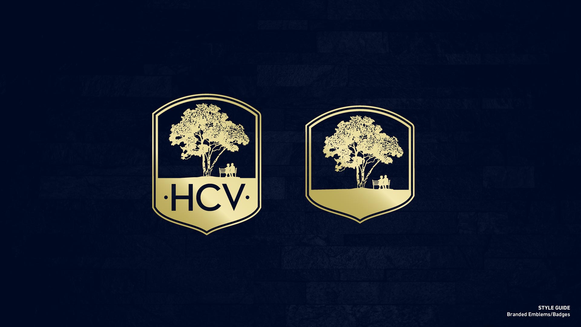
At this point we began to consider variations. HCV particularly wanted to try containing the updated mark inside of a shield that we experimented with in round two:
Round 4
After polishing up the previous round, we presented the work-in-progress to an HCV focus group comprised of the board, a handful of residents with design backgrounds, and a couple of the Brothers of the Holy Cross. Our initial typeface was Neutra, a classic modernist font inspired by the architect Richard Neutra. This turned out to be highly controversial. We had a 50/50 split between love and hate it, with zero in-betweens. The haters didn’t like that we had migrated away from the ornate cursive of the original V and wanted to see that aesthetic incorporated throughout. They were also attached to the tree from the old logo, and wanted to transition from old to new logo more seamless and less controversial. As disheartening as it can feel to go backwards in the design process, it’s sometimes necessary to arrive at something everyone can be proud of.
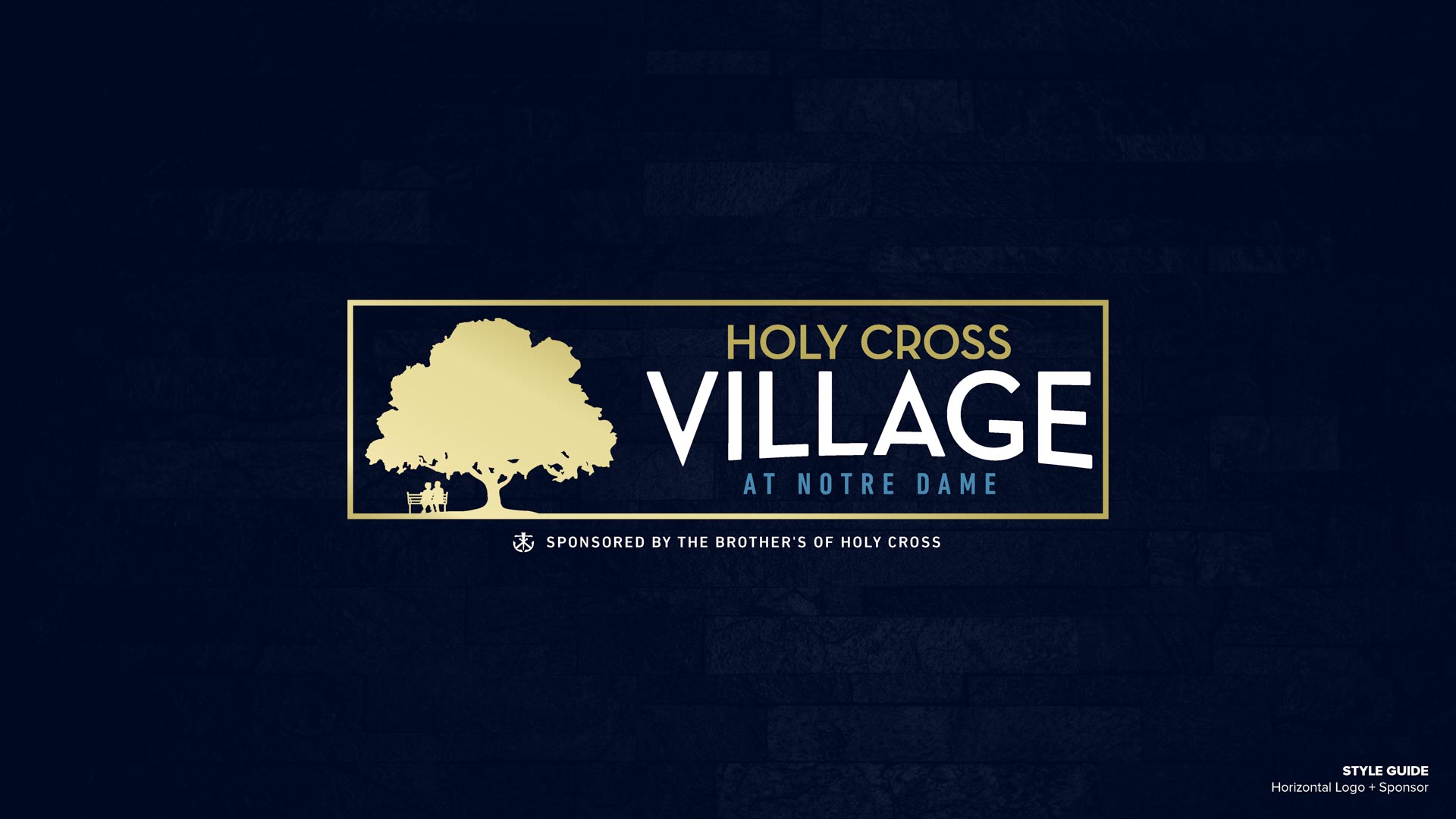
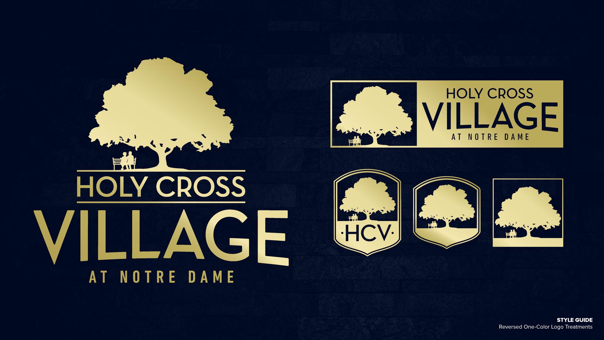
Final Branding Assets & Guidelines
Taking all of HCV’s feedback into account, our next iteration concluded with this result, which was met with enthusiastic approval.
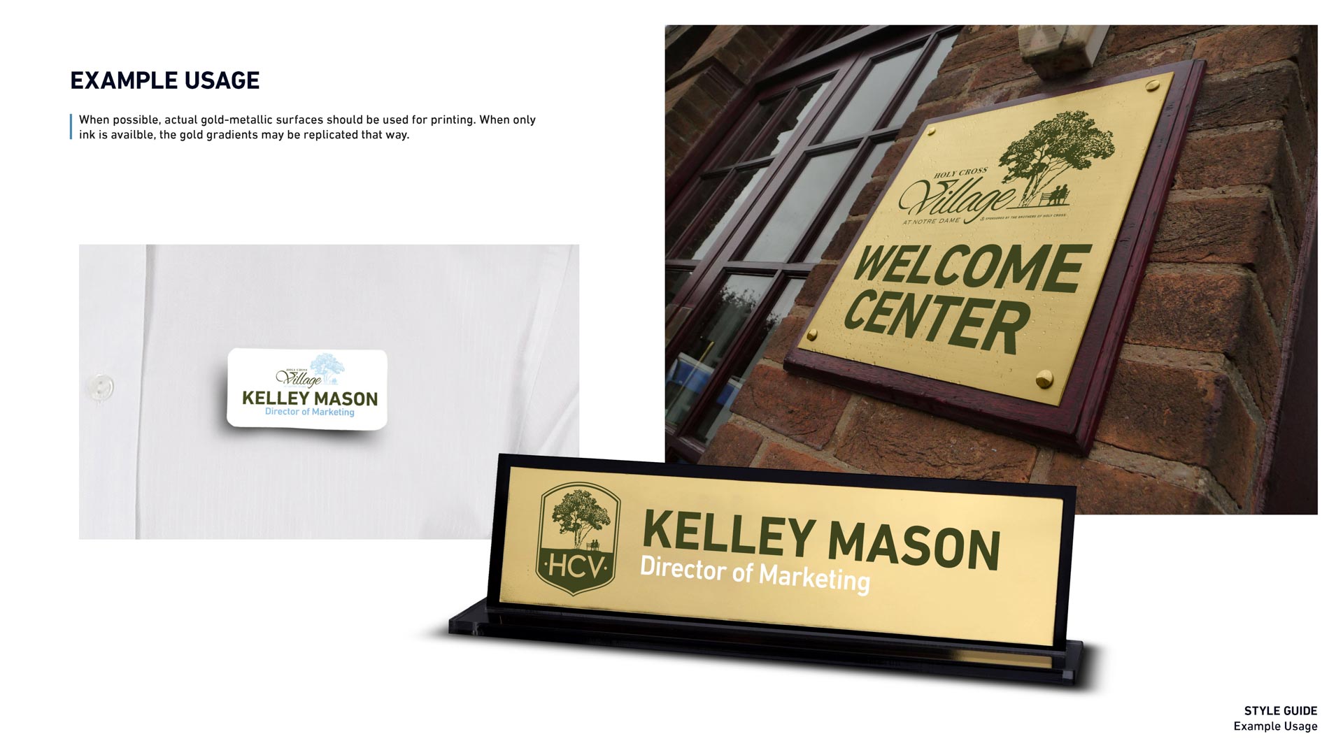
We’ve since been rolling out the new branding on project-to-project basis, working closely with HCV’s awesome internal marketing team. We’re still on retainer to develop business cards, advertisements, and other content, and perhaps more importantly, training their team to work independently of us whenever possible. After all, it’s cheap to print, but it’s not cheap to design. Their internal team quickly learned that they don’t have to be certified Adobe grandmasters to update our user-friendly templates, and now the training wheels are coming off. Our training in particular has already saved HCV thousands of dollars, and will continue to save thousands more in the long run.