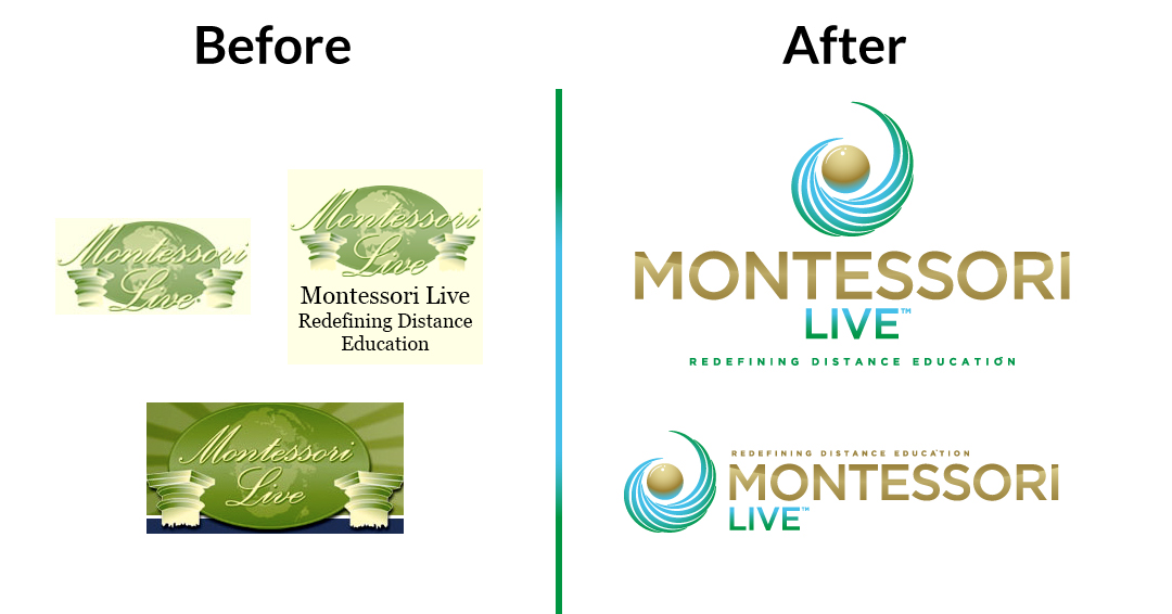
Our rebrand project with Montessori Live, the first online certification system for Montessori teachers, flowed out of our deep involvement with Montessori Edison Lakes. Because we came in speaking the same language, we were quickly able to determine the scope of challenges and what precisely they needed help with.
We settled on three main priorities:
- The brand needed a modernized design, look, and a unified marketing narrative.
- The website needed to be completely redesigned to match these new standards.
- Their third party e-learning environment would need the same treatment, if possible.
Creating a new company logo is an iterative process, but it’s a lot of fun for those involved. There’s something special about being a part of the process of branding your organization as an employee. It’s a visual representation of what you stand for. It gives you more pride and ownership in every bit of work you do. We get a lot of joy out of seeing this happen with the passionate business owners and teams we work with. The goal of the process is to end up with something everyone loves and can be proud of. There’s no settling when it comes to creating your company’s logo. Everyone involved needs to feel good about it, including us!
We begin every rebranding process getting everyone on the same page about what constitutes good design. In the process, we’re able to align our expectations, revisions, and final outcome. During the educational portion of our process, we learn everyone’s likes and dislikes. These initial discussions, along with more direct follow-up questions from us, inspire the first round of concepts. The goal is to start broad and refine with each iteration. On this project, we ended up starting out headed in one direction, and the discussions that followed led in another, with new and unexpected discoveries with each round.
Round 1
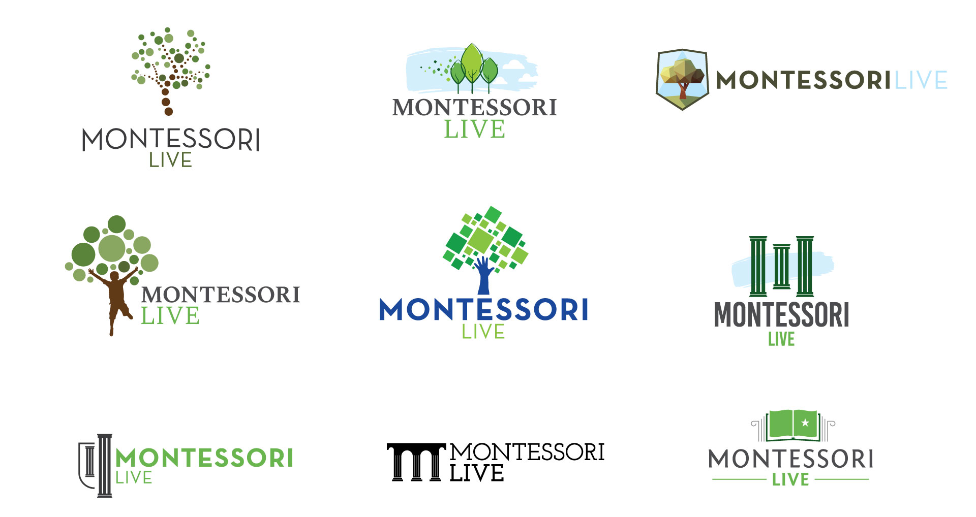
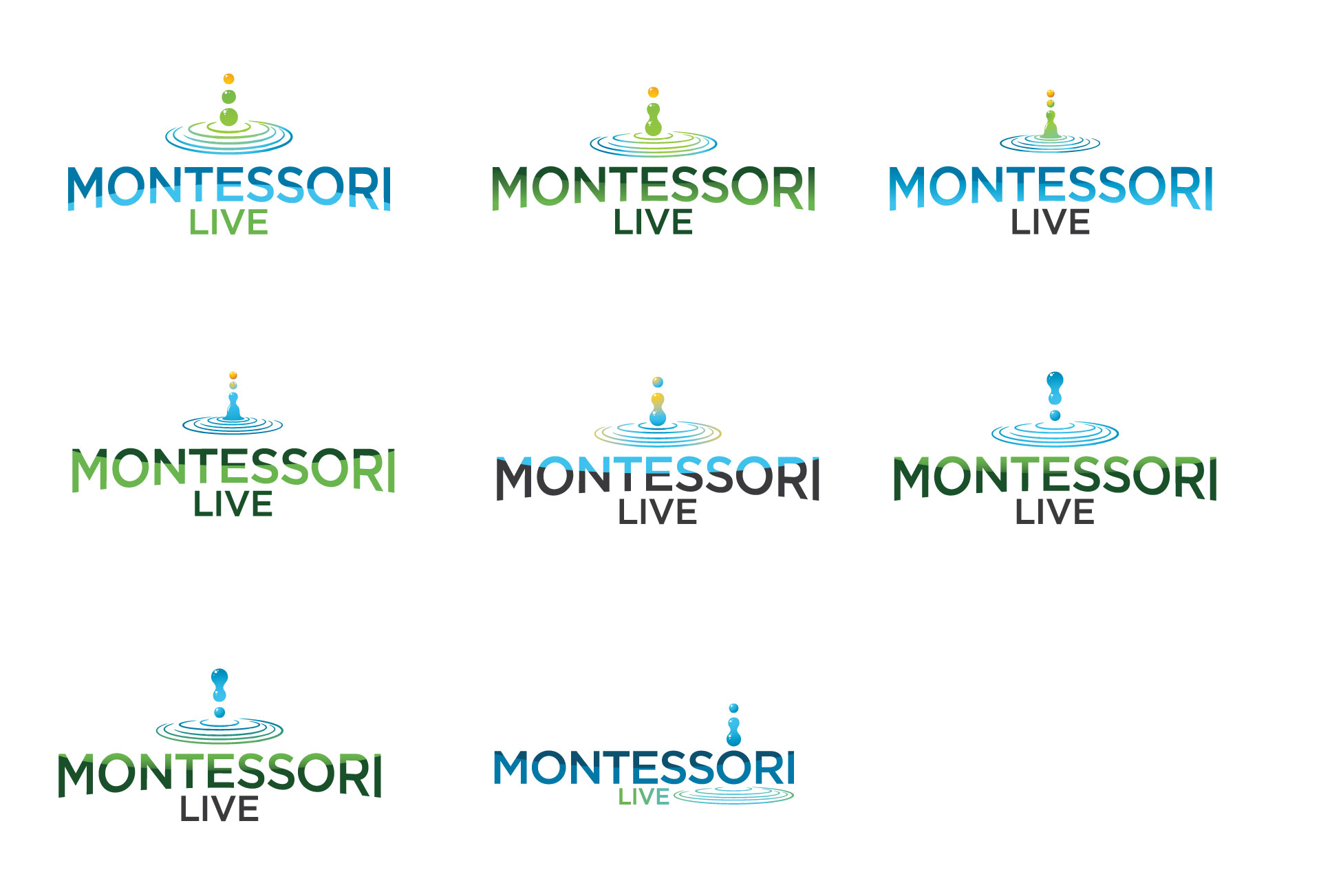
We had a lot of creative freedom at the beginning, and initially pulled inspiration from all over the education industry. While we found lots of trees, hands, shadow children, books, and shields, Montessori Live wanted to retain the pillars from their original logo. We added the pillars in a few of the concepts, even though we thought it’d be challenging to make them fit within the modern design aesthetic we were trying to encourage. Some of those variations are in the top row below:
Round 2
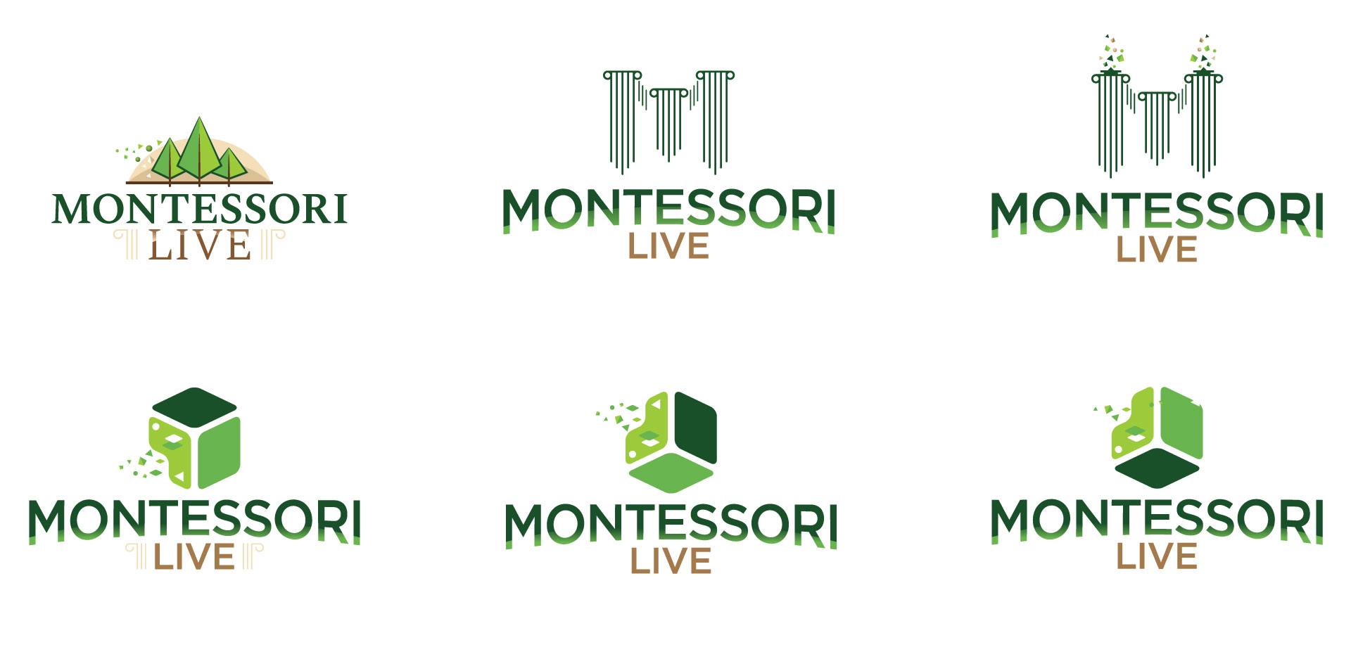
The first set of concepts gave the Montessori Live team a lot to think about. They still wanted to see an evolution of the pillar concept, but we also asked them to branch out and consider other possibilities. Things started to get interesting when they riffed on the theme of well-known Montessori learning materials, of which the cube is one of the most fundamental and ubiquitous. We made a few variations on small pieces gravitating towards a fully-formed cube would stick–see row two, above–but our journey was just beginning.
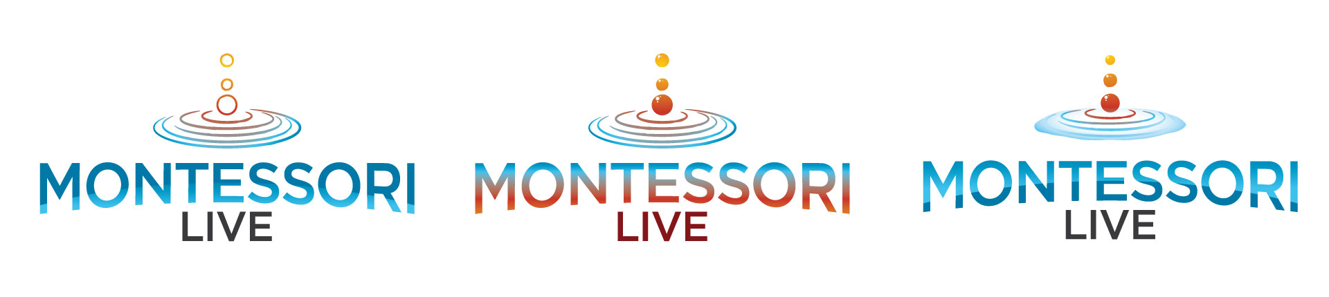
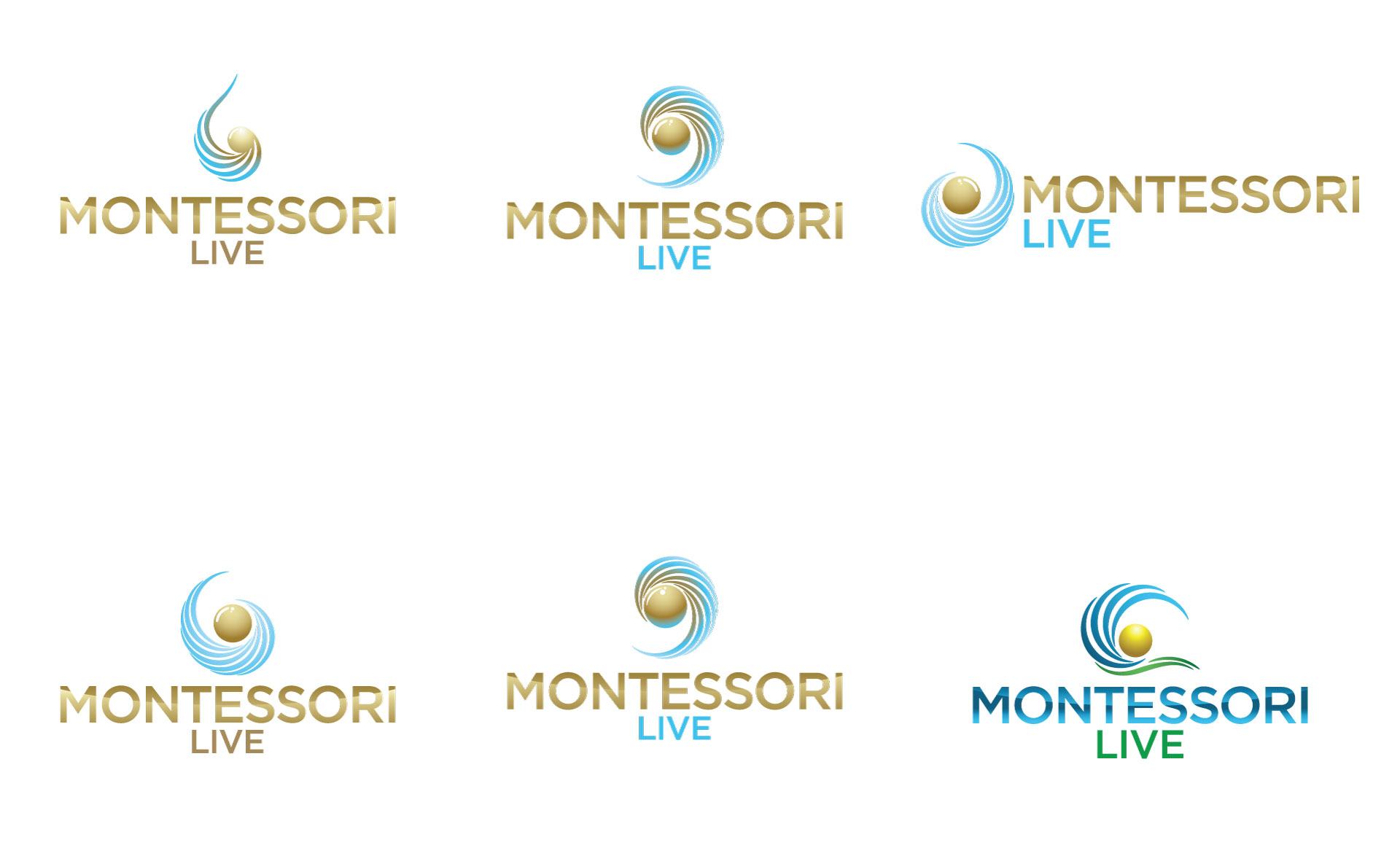
They asked us to make something involving the famous Pink Tower, below, which was developed by Maria Montessori and is standard in every Montessori classroom. Once their team started thinking of other common Montessori materials, we were off to the races. Their team also proposed working with Nienhuis Beads, which are also standard in all Montessori classrooms as a tactile way to introduce elementary mathematical concepts and especially decimals.
We thought it’d be a powerful visual to take an individual strip of the beads and drop them into water, thus creating a ripple. Metaphorically, this represented Montessori Live maintaining the traditional core values of Maria Montessori–the bead–while they try to disrupt the status quo of the industry by offering an online certification option–the ripple. Now we’re looking at something fundamentally different than the previous round:
Round 3
The discussions after this round led to a more focused mission statement for us to try to encapsulate visually: Montessori is all about finding harmony within the analog world–in other words, nature. We ended up with a lot of variations:
Round 4
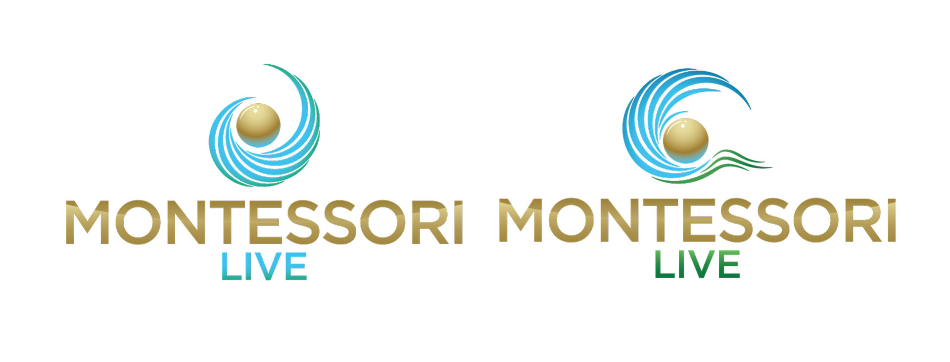
The beads have evolved to looking like water droplets, which is a bit of a logo cliche. We agreed it made sense to try to turn the ripple into a wave.
Round 5
By the fifth round, we were solid on the bead and wave concept, but needed to mold the two into one. We wanted the bead and the wave to appear in the same visual universe, if you will. This would represent the kind of harmony at the core of Montessori Live, and combine all the other cool metaphors we were going for.
And then there were two.
Finally, we were down to two. The variation at left was the clear winner; their team found the variation at right a bit much. Now we just had to add some polish to the winner and create a repository of new digital assets to match.
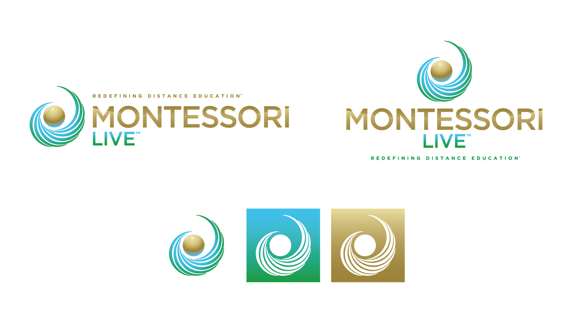
One of the biggest tangible benefits of investing in a rebranding project is that you gain customizable branding assets that look good on everything. The majority of small businesses, nonprofits, and schools we encounter tend to have one or two low-res image files given to them by a marketing agency years in the past. Updated digital assets offer flexibility for digital and print: documents, ads, PowerPoint templates, contracts, business cards, merchandise, website, social media properties…it goes on and on.
Above, you’ll see a horizontal banner logo, a vertical logo, and then 3 social media icon variations. We also provided a large repository of document templates, a newly designed student handbook, three different types of business cards, updated certificates and diplomas, a brochure, a one-page handout, and even e-mail signatures for staff members.
All of which can be resized, used on any background, and integrated easily into anything they want to their branding to appear on.