
Branding Project Overview
Christian Gausvik, M.D. reached out to us to help him build a foundation. The mission: facilitating intellectual, cross-generational conversations at local events to bring awareness to issues facing seniors and their caretakers in Cincinnati. Christian’s original idea was inspired by seeing his patients gradually lose their life stories and experiences in memory to Alzheimer’s. For several years he had been hosting local Cincinnati charity events with his husband, Cody Gausvik, and they were growing very quickly. They wanted to develop their own foundation from the ground up, funnel all of their hard work into one place, and make a direct impact locally. So we went over to their house to have a naming party for the foundation and learn more about their story. It turned out to be the exact kind of local partnership we both wanted to be a part of. It was and continues to be a perfect fit for our small, family-run companies.
Round 1
Before we connected, Christian was developing a logo with a volunteer who wanted to build their portfolio and gain some real-world experience. When you’re creating an organization from the ground up, there are always extreme budget restraints, so I’m always an advocate for doing things cheaply. But a classic dilemma resulted: you get what you pay for. When you have an inexperienced designer taking a crack at something, you’re probably not going to be satisfied with the final result, especially on a tight turnaround.
Meanwhile, I was building the Giving Voice Foundation’s website while waiting on the new logo to be finalized by the volunteer designer. Christian confided that their work just wasn’t hitting the mark. Under more relaxed circumstances, we might have been able to make things work with the volunteer, but we were running out of time prior to the our website launch. As the deadline loomed, I did some quick mockups of possible Giving Voice logos with the intention of winning Christian over. Normally, I don’t move forward with designing a logo for a client without a payment agreement up front, but under the circumstances, something had to give. Fortunately, he liked what we brought forward, and we were quickly off to the races.
We had some rough themes to start:
- Bronze + Teal or Blue + Teal Colorings
- Thin fonts
- Ginkgo Leaf / Tree
- Giving Voice Foundation fully spelled out
- GV as an icon
- …or a mixture of the two
Ginkgo leaf is used extensively in helping with memory loss, and the species of tree itself is the oldest in the world. It immediately felt right to incorporate in the foundation’s logo.
Round 2
Since Christian’s foundation is built around the community of people that attend his events, it was important to not only create a mechanism to get feedback from everyone involved, but make that feedback actionable and productive.
We asked Christian to provide us with his initial unfiltered feedback on the first round of concepts, and encouraged him to solicit the opinions of his family and friends.
To summarize their first round of feedback:
- Fonts needed to be thinner and cleaner looking. Clean became the principal focus.
- Could the leaf be more “brain” looking?
- Multi-hued blues felt right as a color palette.
- No one was 100% in love with anything yet.
To make a long story short, we first explored combining a leaf and a brain, and then experimented with making the brain look a bit like a speech or thought bubble, which would represent the intellectual discussions they were inspiring at their events.
We played with busier leaf concepts, but the ones that really stuck out were the clean brain + leaf + speech bubble icons towards the end of the gallery above. When I sent the next round off to them, it was love at first sight.
Round 3
When working with branding, in every last round of iterations we try to include two main ideas–it tends to get us to 100% certainty when selecting a final logo concept. The leaf/brain icon was lovely, but a bit too busy. Keeping things clean was still paramount.
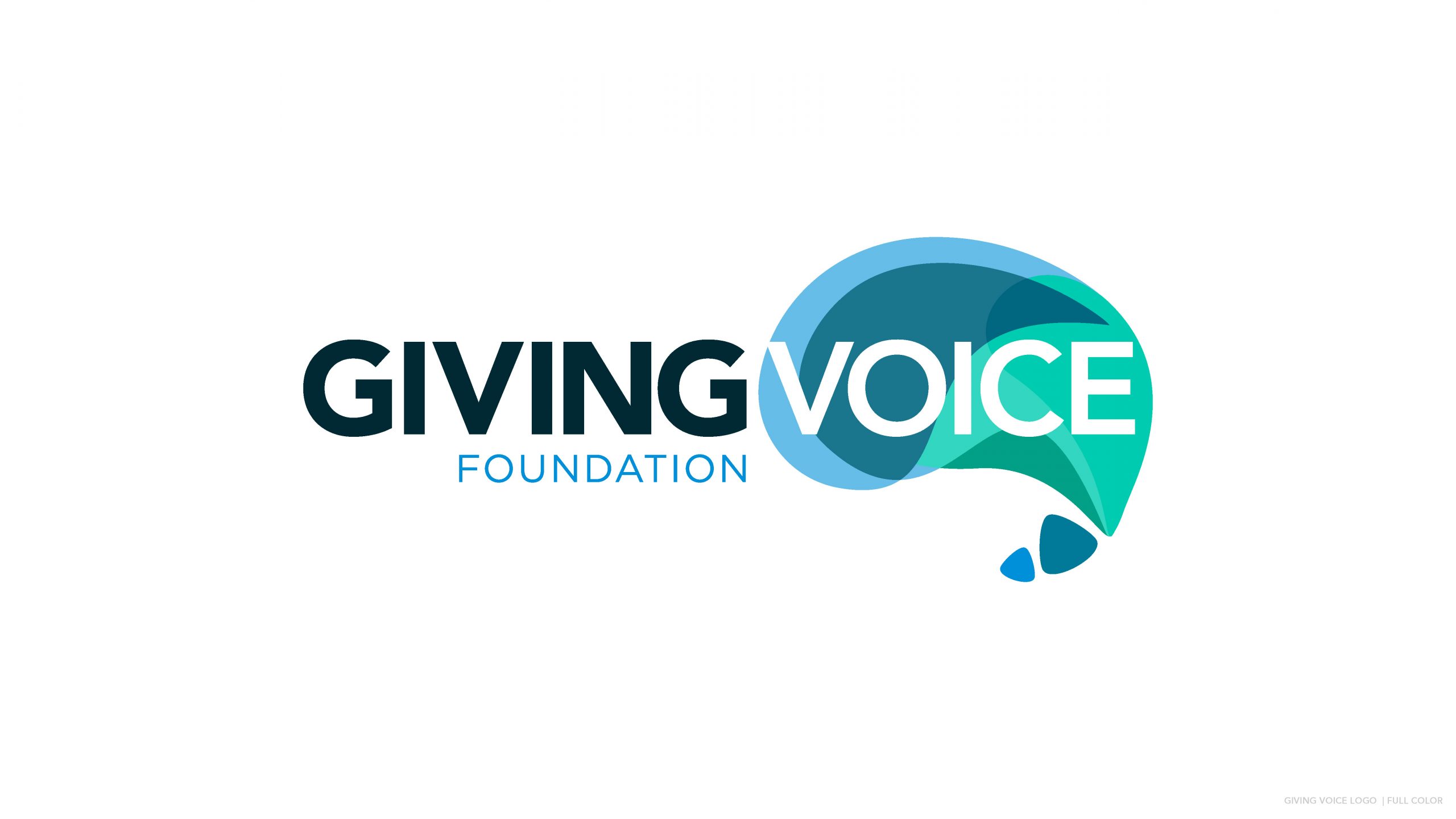
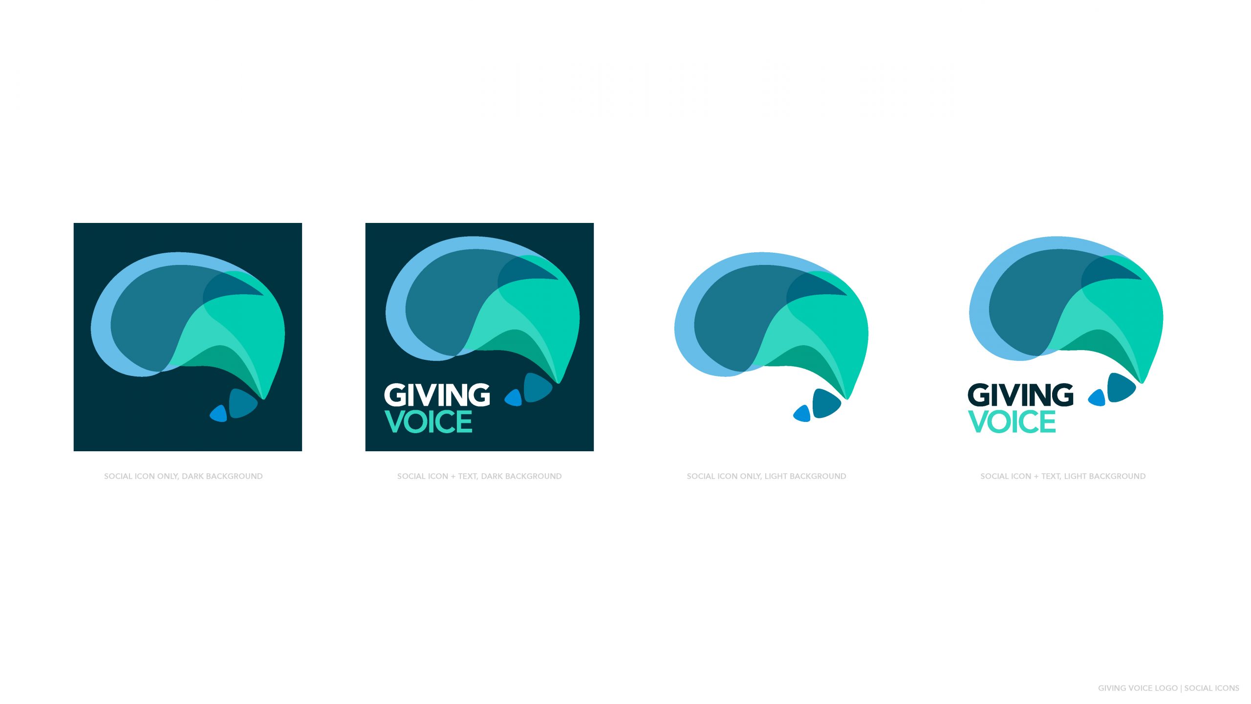
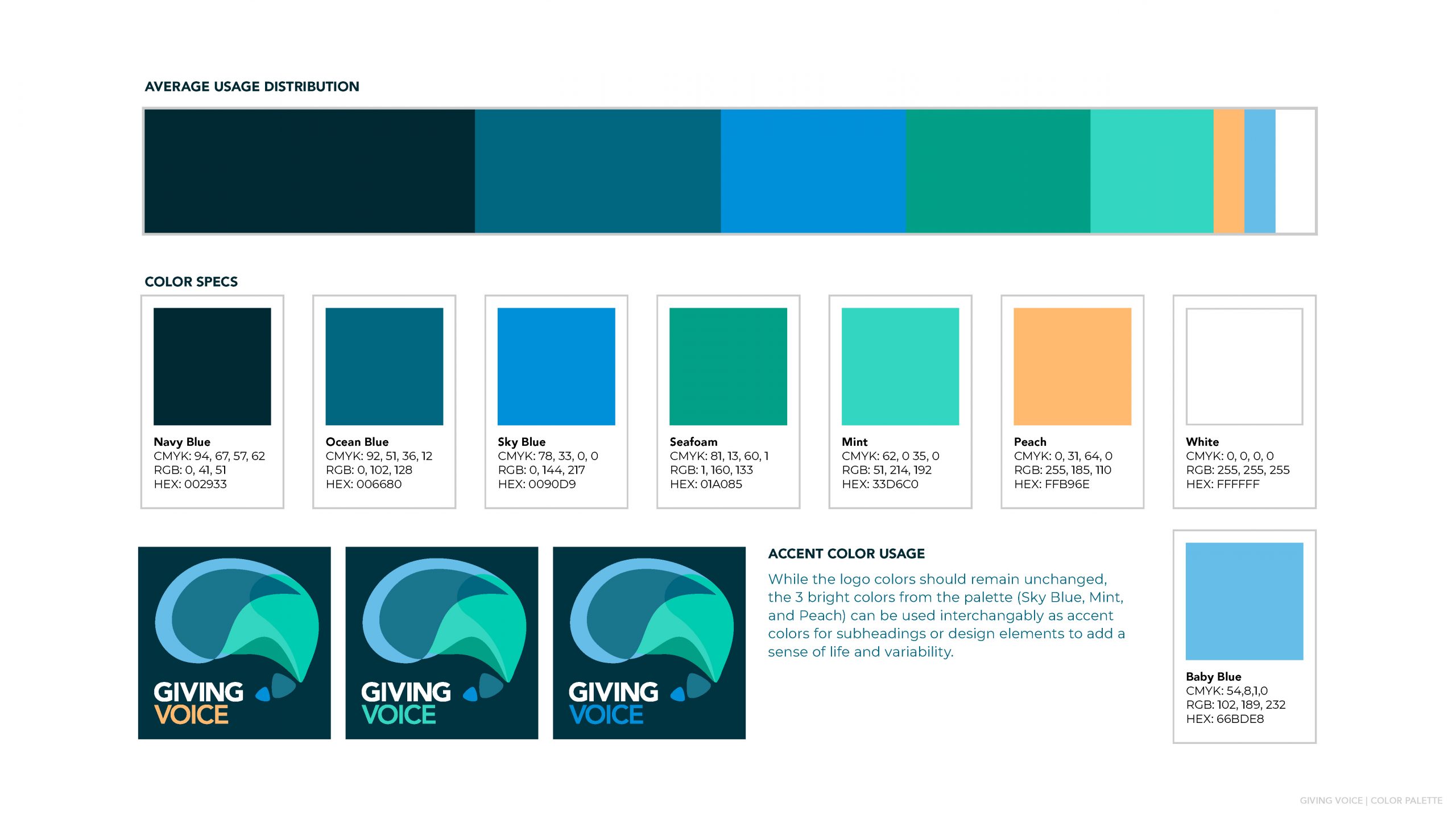
Deciding Colors, Fonts, & Social Icons
After more iterations, we started to finalize the colors, solidify font pairing, and lay out social icons. The mixture of blues/teals ended up being the winner, but it was fun for the GVF team to consider alternatives.
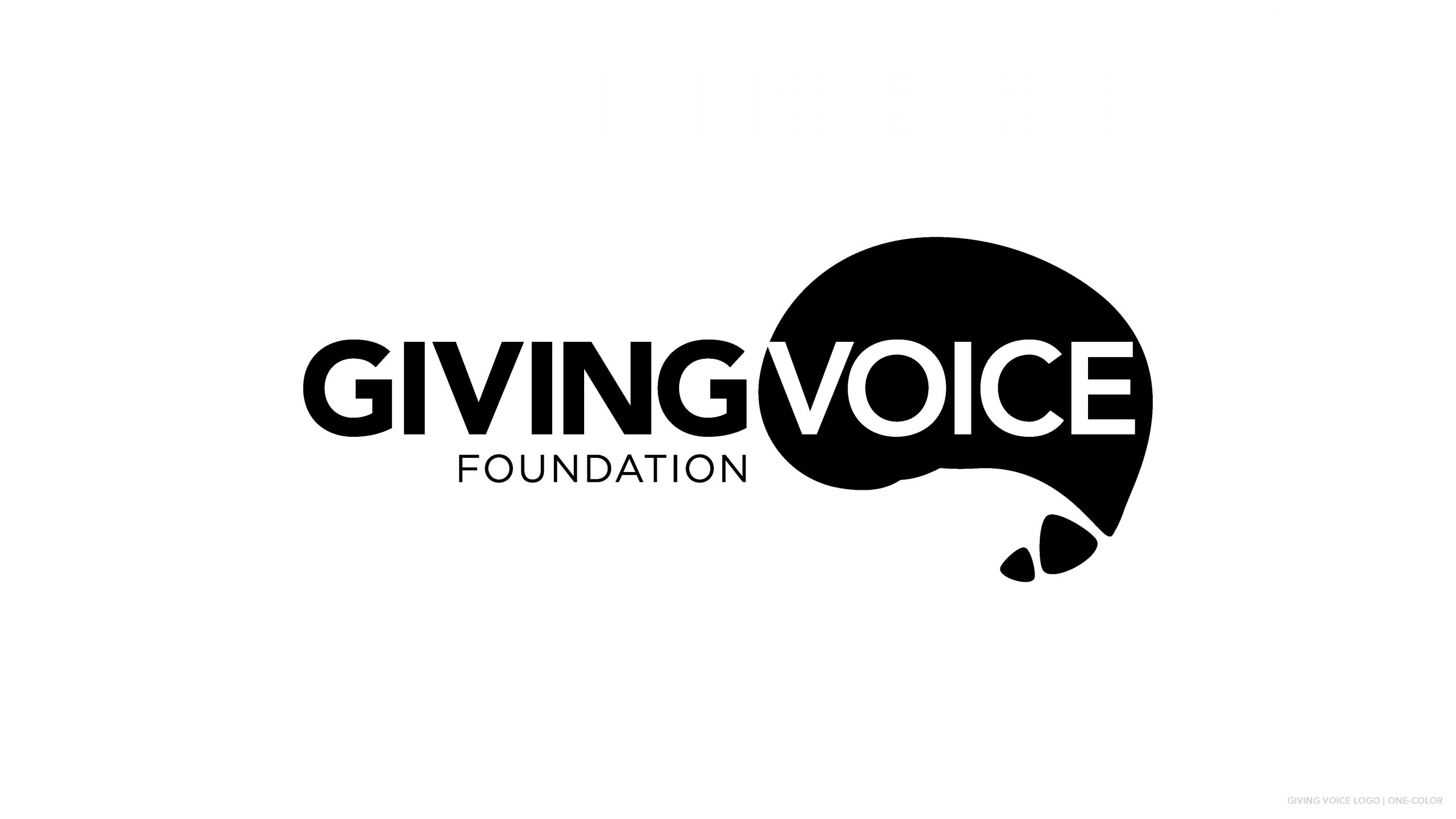
Final Master Branding Guidelines
The images below include the master branding guidelines provided after everything was finalized. These continue to make it easy for GVF to collaborate with third-party vendors, merch producers, outside designers, and future employees as the Giving Voice Foundation grows.